Digital Beach Party: Los Angeles Public Library’s Photo Collections

I started researching this post on April 8th; it was snowing. Twenty days later, we’ve had some warm weather, but the arrival of spring continues to be fairly sluggish, so you can file this installment of Pixels under “I just want to look at summery pictures.” If, like me, you’re also mentally exhausted from another demanding week and feeling that everything is getting just a little “too real,” then you probably want some element of magic and fantasy to your visual getaway.

Warm? Outside of reality? Magical and fantastical? Okay got it.

Los Angeles, California. In the past.

Enter the Los Angeles Public Library’s Photo Collections. Unfortunately there’s no curated browse feature that just lets you look at pictures of California beaches in the 1950’s. And it’s a pretty austere interface considering the content. But the content… the content…

sogood

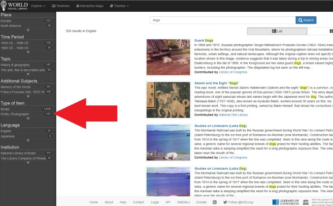
Naturally my first search was “beach,” but that wasn’t quite right, guessing from the first page of results. Here’s result #2 for that search:

00111608

“Humphreys Elementary School Auditorium,” David Greenwood, 2011.

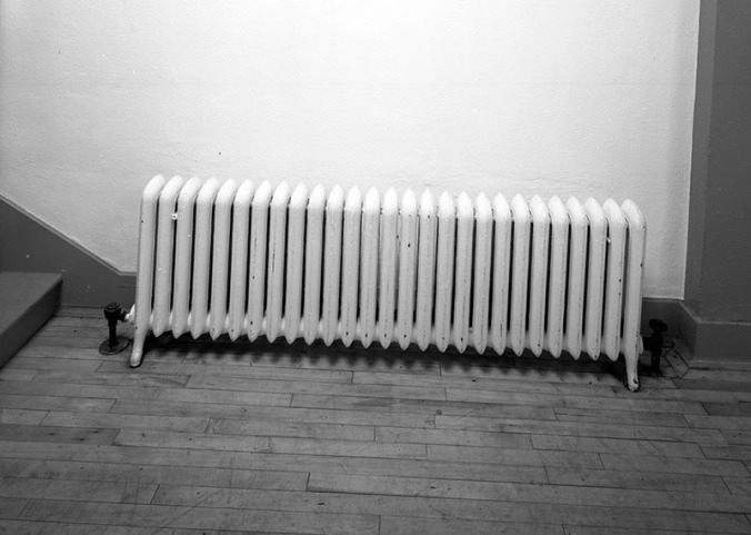
Okay so this particular result was lacking not only in the setting, but also the date. Not quite the glamorous 50s beach pictures I had in mind.

(However, if you look at the record for this image, you can see how thorough their cataloging is; one of the subject headings for this image is Radiators California East Los Angeles! You know, if you’re interested in California radiators.)

Searching “Beaches” provided a much better set of results: 191 pages of them!

Clearly we’ll need to delve into this a bit in order to find some escapist beachy images.

Some of the initial results show some more recent images of Venice Beach:

00066953

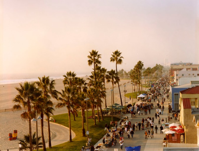
“Venice Boardwalk in November,” Cheryl Himmelstein, L.A. Neighborhoods Project, 2002.

00066960

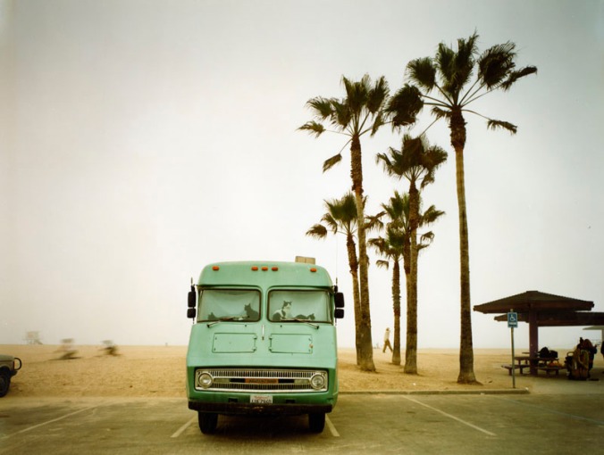
“1972 Dodge Chinook, Rose Avenue Beach Parking Lot,” Cheryl Himmelstein, L.A. Neighborhoods Project, 2002.

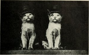
See the cats in the window of the van?! Honestly, not related to what I want as such, but holy smokes, you have to look at the subject heading Cats California Los Angeles. The captions might be as amazing as the pictures themselves.

00084342

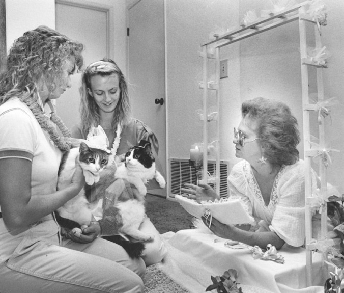
“Cat Wedding,” James Ruebsamen, Los Angeles Herald-Examiner, 1986.

00116812

“Teeny’s Brood’s a Dilly,” Bob Martin, Valley Times, 1963.

I love that cat birth announcements were news in 1963.

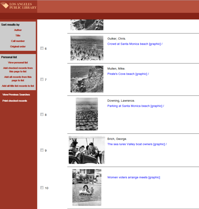
I digress… Back to pictures of Venice Beach. On about page 4, I decided it was time for a new search with delimited dates. So I searched “Beaches” with the dates between 1950 and 1960.

00050167

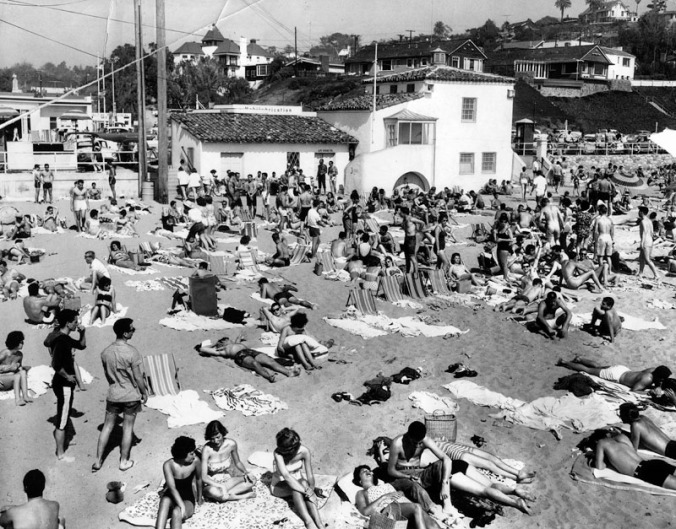
“Summer is Here!” Los Angeles Herald-Examiner, 1960.

That’s a pretty good start!

Although, to be honest, the rest of the pictures are mostly aerial views, although there are some toward the end that are cool.

Arguably, the site lacks a certain user-friendliness. Linking to searches brings up an “expired session” page, as will opening too many tabs at once. So, I’ll provide a (sad) visual of the searches that produced the best results.

Beachgoers

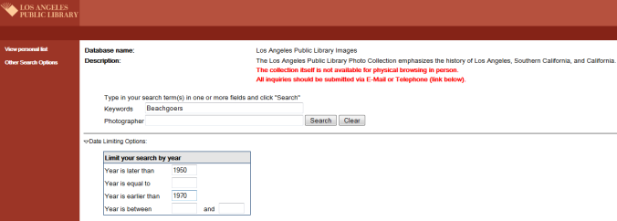
Keyword “Beachgoers” with set dates between 1950-1970: 24 pages of results

Beachgoers_Results

Results: things are pretty beachy!

Keyword offensiveness levels: low.

Sunbathing

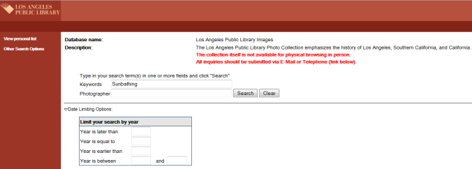
Keyword “Sunbathing”: 9 pages of results

Sunbathing_Results

Results: some summery views and some old school glamor

Keyword offensiveness levels: medium.

Bathing Suit

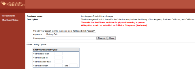
Keyword “Bathing suit”: 15 pages [FIFTEEN] of results

Bathing Suit_results

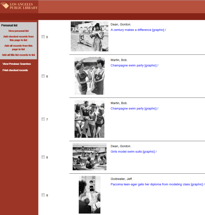
Results: Jeez. That is so LA.

Keyword offensiveness levels: high. So high. But, hey, if you want mid-century LA at its most glamorous, that’s where it’s at.

Bathing1

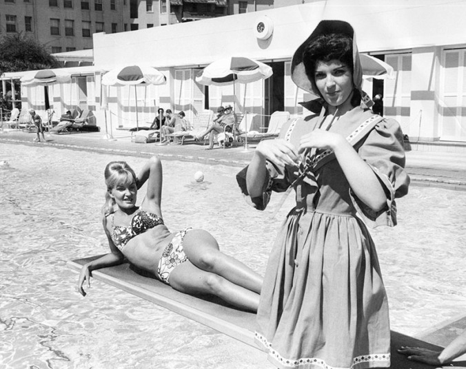
“A Century Makes a Difference,” Gordon Dean, Valley Times, 1963.

But still pretty much offensive.

Bathing2

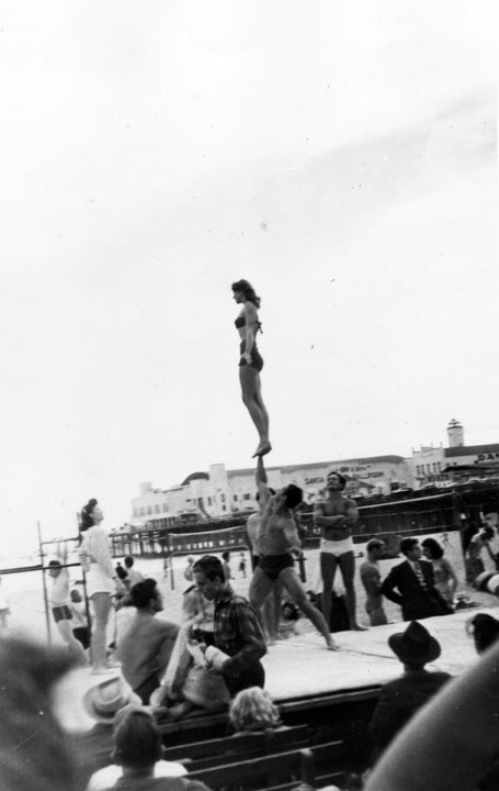
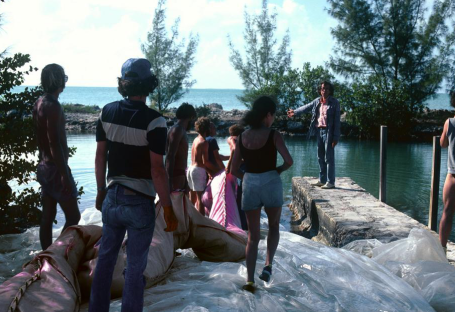
“Acrobats on Santa Monica Beach,” Shades of L.A.: Sri Lankan American Community, ca. 1949.

Bathing3

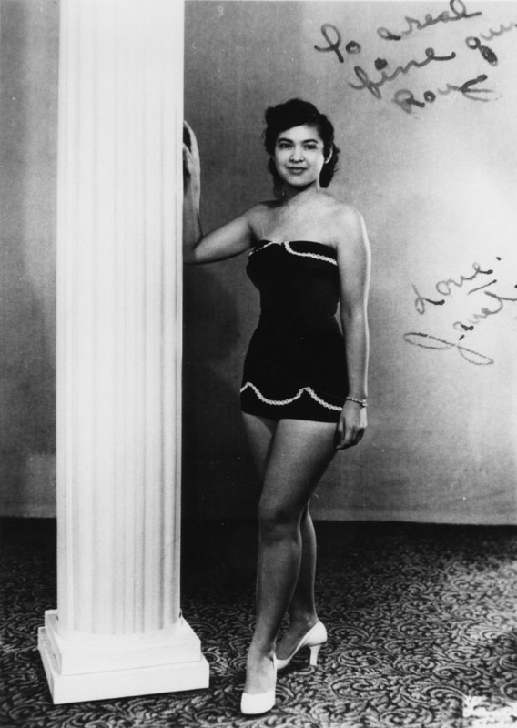
” Miss Filipino Community of Los Angeles,” Shades of L.A.: Filipino American Community, 1955.

Bathing4

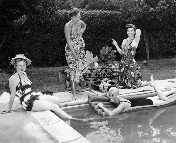
“Luau Planned by Juniors,” Valley Times, 1956.

Bathing6

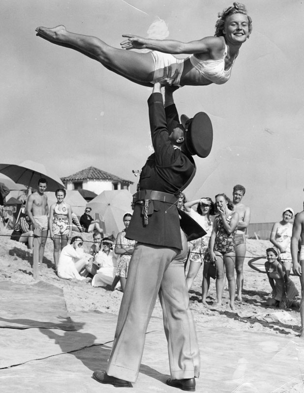
” Club Casa del Mar Gymnasts,” A.P. Griffin, The Los Angeles Herald Examiner, no date.

Bathing 5

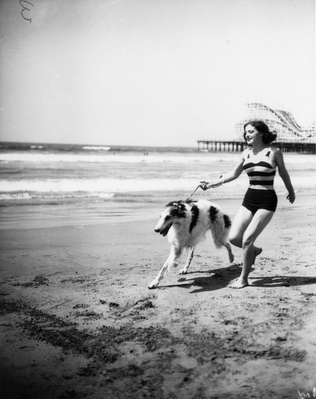
“Dog Show,” Security Pacific National Bank Collection, ca. 1925.

I suppose we can infer from the over-representation of photos dating to the pre-1970s with “Bathing Suit” as a keyword that subject headings and cataloging have certain become more enlightened.

On the whole, this database is just really fun. If you’re looking for something specific, well, it might take a while. Just for fun, I keyword-searched the queen of mid-century glamor herself, Marilyn Monroe, and the first 11 pages of results are just interior and exterior photos of the Los Angeles County Hall of Justice from after it was damaged in an earthquake in the 1990s. Apparently Ms. Monroe’s autopsy was performed there (as was that of her reported paramour, JFK). Out of 24 pages of results, there isn’t a picture of Marilyn until page 14. It’s a little frustrating that the results aren’t sorted by relevance but by date, beginning with the newest. And it’s extra morbid in Marilyn’s case because there are pictures of her crypt and a body bag being wheeled out of her house before there are any pictures of the woman herself. Yeesh. Undated photos or even photos where the last digit of the date is unknown (e.g. 198-?) end up at the bottom of the results list.

Frustrating as the database may be for all of its little quirks, it’s certainly fun to browse and you’ll inevitably learn something new. For example, I searched the name of another glamorous actress, this time from the early history of film, “It”-girl Clara Bow. While there were no pictures of the actress herself, I found out instead about the salacious Wright murder scandal from 1937.


Bow2

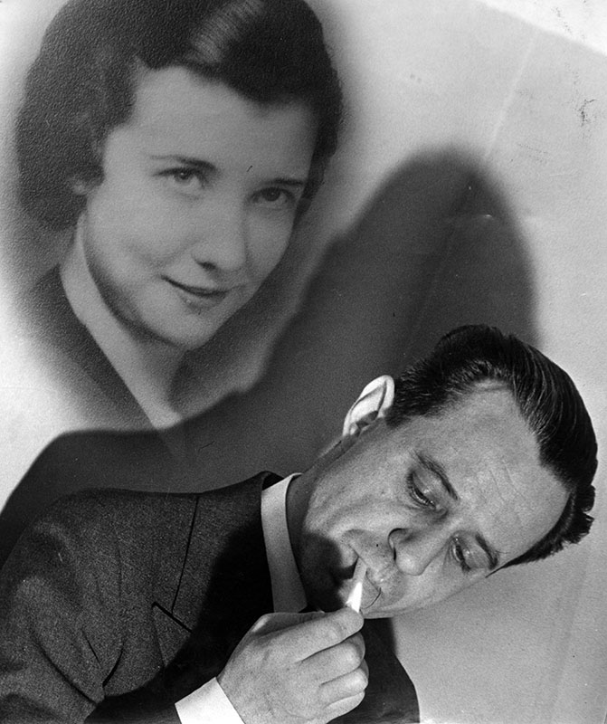
“Paul and Evelyn Wright,” The Los Angeles Herald-Examiner, 1938.

Here’s what it says under historical notes:

Paul Wright, an aviation company executive, and his friend, John Kimmel, attended a private club meeting on the evening of November 9, 1937. After the meeting they went out for a nightcap at Clara Bow‘s “It Cafe” in Hollywood. It was getting very late so Paul suggested that John accompany him home, ostensibly to provide back-up when his wife Evelyn questioned him about where, and with whom, he had spent the evening. It was after 2 a.m. when they pulled up to Paul’s hilltop home in Glendale. Once inside Paul said he felt fatigued and went to the bedroom for a nap–leaving Evelyn to entertain John. Paul later recalled the events of that night, “I was awakened by some sort of sound–like a piano. It started me out of my sleep. I went to the living room door and saw that the lights were still on. Johnny was sitting at the piano. I could just see his head. He was looking downward. I couldn’t see Evelyn and I wondered where she was.” It didn’t take him long to figure out where his wife was. At that moment everything inside of Paul exploded in what he later described as a “white flame.” He got his gun and shot John and Evelyn to death. Paul was put on trial for the slayings. His attorney, Jerry Giesler, had conceived of a creative defense for his client. He said that Paul’s WWI service (during which he was gassed), a post-war tuberculosis attack, and a voluntary vasectomy combined to make him emotionally unstable–capable of more violent reactions to shock than normal men. At the time of his arrest Paul had confessed to the murders, but when he got to trial his story changed and his memory conveniently began to fail him. How would the jury view his shifting story? The jury of eight men and four women listened to the x-rated testimony and contemplated Giesler’s vasectomy defense. In the end, they found Paul Wright guilty on two counts of manslaughter. But there was a twist–the jury also found that he had been insane at the time of the murders so he was not guilty. When the Lunacy Commission examined Wright they concurred with the jury that Paul Wright was no longer insane. He was freed and would never serve a single day in prison.

That’s a pretty shocking tale. Apparently (according to another photo of the murder scene), Wright had originally said the two were simply “in each other’s arms.” Those Hollywood lawyers and their wild defenses, I tell ya. No real respect for the law! And it’s just as bad today! Also I need to tell those pesky kids to get off my lawn. *Shakes fist and mutters*

Incidentally, Jerry Giesler was also Marilyn Monroe’s divorce attorney when she and Joe DiMaggio split up, and he defended Lana Turner during the Johnny Stompanado murder case. Later, his son was all mixed up in various legal ordeals, including a drunk driving accident that injured Edward G. Robinson Jr. and another that was described in the archive as “he assertedly [sic.] tried to ‘buy’ a cab ride with a .38 caliber revolver.” Those rich kids think they can get away with anything.

Maybe they can today, but not in 1936. Back in those days, folk couldn’t get away with shenanigans like immodesty and immorality. Especially if one happened to be a woman.  Or at the beach.

beach patron

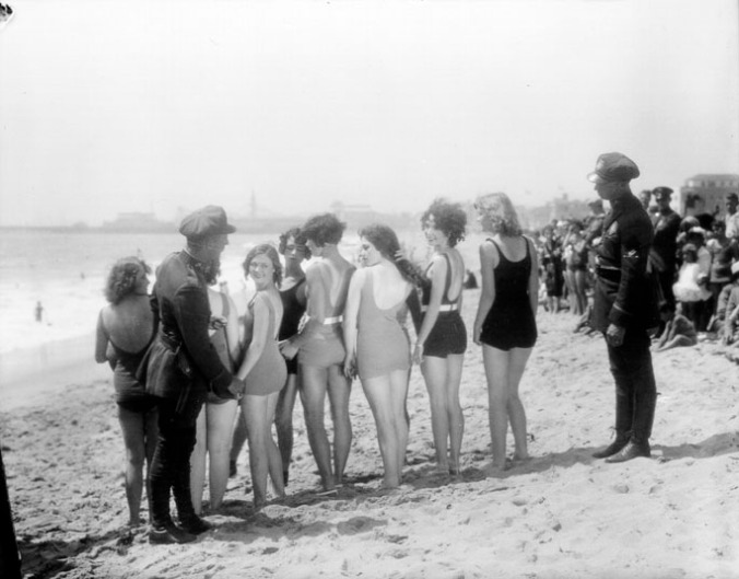
“Beach Patrol Checking Women’s Bathing Suits,” Security Pacific National Bank Collection, 1936.

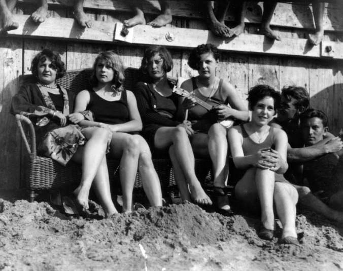
The whole “the past was better!” old person act aside, there is something sort of compelling about these old photos. Some of the ones from the 30s are so high-def that you can kind of imagine yourself or your friends in them. The past can often seem hazy and distant, and what is handed down to the present is often just a caricature. We think of the 20s and its tommy guns, gangsters, prohibition, flappers, the Great Gatsby, and martinis. But these pictures sure make it seem like wasn’t really all that different from today.

swimmers

“Swimmers at the 1928 Pacific Southwest Exposition,” Security Pacific National Bank Collection, 1928.

doggie

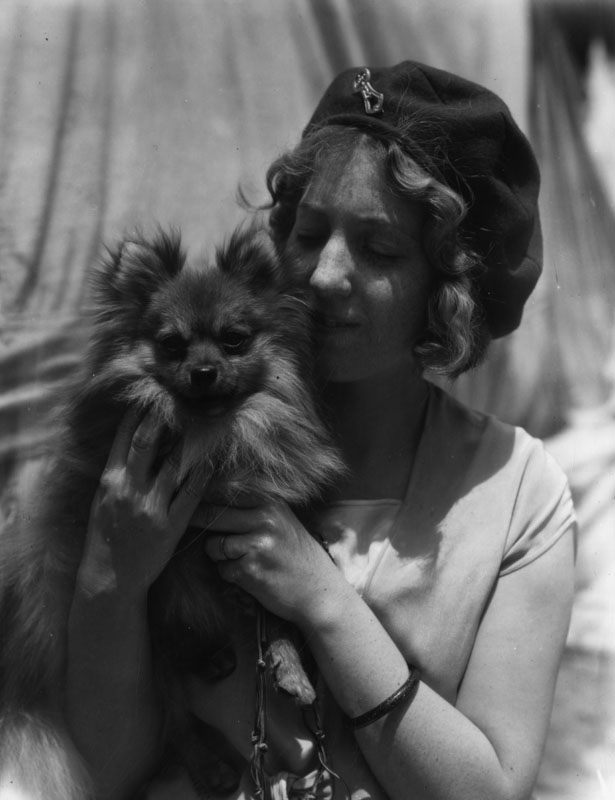
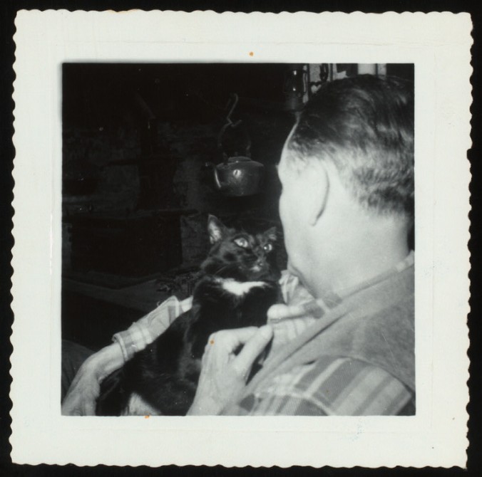
“Dog Show,” Security Pacific National Bank Collection, 1929.

This is basically me every time I get home to my dogs. Minus the finger waves.

beach

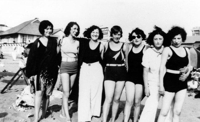
“Friends at Ocean Park,” Shades of L.A.: Jewish Community, 1929.

grapes

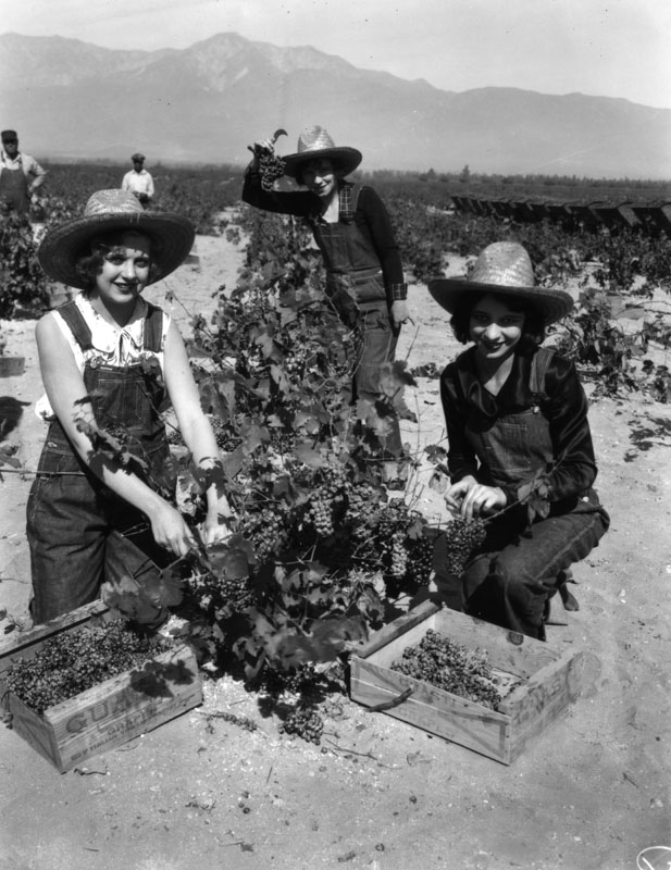
“Women working in Gausti Vineyard, view 11,” 1929.

boating

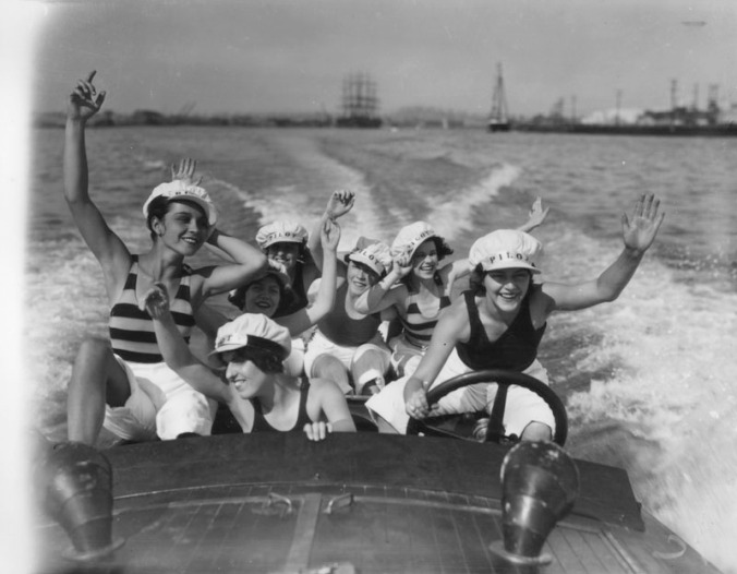
“Boating at the 1928 Pacific Southwest Exposition,” Security Pacific National Bank Collection, 1928.

Ah the 20s. If you want to see just how awesome and independent women seem to have been in 1920s LA, I recommend searching “women” with the dates delimited to 1920-1929.

I hope all these fun, sunny California pictures have helped you feel a little warmer. It won’t be long until those dreams of summer are a reality! And maybe if you’re very lucky, those dreams of California will come true too.


Visual Literacy and Infographics

Yay! Spring Break!

It’s finally upon us, that “week off” you’ve all been wishing and begging for is almost here. Maybe you have something exciting planned–a vacation, an adventure, an extended period of wearing nothing but pajamas–or perhaps you’re using this time to get caught up on work. If you’re in the latter category, consider this blog post an entertaining break for your brain. If you’re in the former camp, firstly, you should know that I’m jealous; secondly, consider saving this post for if/when you find yourself living that paradoxical cliché: “I need a vacation from this vacation,” which, I believe, belongs to the “Grass is Always Greener” school of thought.

Visual literacy is hot right now. Hotter than the beach in Florida you’re sunning yourself on? Maybe not; I have no idea what the future temperature of a hypothetical Floridian beach may be. But, believe me when I say it’s a topic with a lot of currency. First of all, what is visual literacy?


If you’re more of a “chunk of text” person,  read more about the ACRL’s (Association of College and Research Libraries) definition of visual literacy below:

Visual literacy is a set of abilities that enables an individual to effectively find, interpret, evaluate, use, and create images and visual media. Visual literacy skills equip a learner to understand and analyze the contextual, cultural, ethical, aesthetic, intellectual, and technical components involved in the production and use of visual materials. A visually literate individual is both a critical consumer of visual media and a competent contributor to a body of shared knowledge and culture.

 In an interdisciplinary, higher education environment, a visually literate individual is able to:

• Determine the nature and extent of the visual materials needed
• Find and access needed images and visual media effectively and efficiently
• Interpret and analyze the meanings of images and visual media
• Evaluate images and their sources
• Use images and visual media effectively
• Design and create meaningful images and visual media
• Understand many of the ethical, legal, social, and economic issues surrounding the creation and use of images and visual media, and access and use visual materials ethically

Read more about the ACRL’s visual literacy standards here.

For the purposes of this blog post, I’d like to single out the two of these in bold above, known as Standards three and four, and share a couple of their relevant (for our purposes) “performance indicators.”

Standard Three:

  • identifies information relevant to an image’s meaning.

Standard Four:

  • evaluates the effectiveness and reliability of images as visual communications.
  • evaluates textual information accompanying images.
  • makes judgments about the reliability and accuracy of image sources.

Now that we have the academic lingo down, it’s time to bring on the fun!

72228fb090e5de1d526c66ef0f753cf0

For the artsy cartoon nerds out there

That image is at least vaguely on-topic, since this post is going to focus on the intersection of image and text, and specifically, the infographic.

First thing’s first, what is an infographic? Simply put, it’s a visual representation of information, usually in the form of a diagram with minimal accompanying text, that seeks to present often complex content in relatively simple terms. You probably already had a pretty good sense of the definition, since you can hardly load a webpage these days without seeing some infographic or other.

But what many people don’t know is just how hard it actually is to find effective infographics. In our image-saturated society, it’s simply not possible to apply your critical thinking skills to every image you’re confronted with. But infographics aren’t selfies; it goes without saying that you’re not going to take a picture your Facebook friend took of her reflection in the bathroom of a dirty bar seriously. And why would you? There’s a toilet in the background.

No, infographics are special because unlike many other types of images, they present themselves as a visually appealing framework for the clear transmission of authoritative, factual information to the masses. In this sense, infographics have a lot in common with photojournalism: news is supposed to be authoritative and factual, available to the masses, clear and succinct, and full of visual interest. Plus, like infographics, a lot of news media is accompanied by text. But somehow the news and journalism are easier to be wary of: we’re more likely to know or question the ideology of the journalist or news outlet, and they’re more likely to tell us. You don’t often get that with infographics. And this is where our bag of visual literacy tricks comes in handy.

Let’s start with an example:

bad viz1

Source: viz.wtf

It looks pretty slick and it’s fairly easy to read the data, so it’s doing a pretty good job, right?

If you look even somewhat closely at this chart you’ll see that there are a lot of problems. And since there are so many, we’ll structure our analysis using the performance indicators of Visual Literacy Standards Three and Four.

  • Identifies information relevant to an image’s meaning.

Let’s start with the most obvious thing, what exactly it is we’re looking at: it’s a chart, specifically a radar chart. It represents the opinions of different socioeconomic groups about the secrets to success. The little legend shows us which colors correspond to which groups. If we look at the top, we see that this is probably from a publication called “Infografika” and it appeared in the first issue. If we look at the bottom, we see the source of the data is the “Obshestvennoe Mnenie Fund” and the name of the illustrator. To speak very briefly about what the data show, it seems “the poor” think that success is based on who you know, and lying and cheating your way to the top. “Rich people” believe hard work is the single greatest determinant for success, while the middle class are evenly split between connections and a good education.

There’s one thing I haven’t mentioned, and that’s the subheading. The first line provides a little information on the methods of the study: people were asked “what’s the secret to success?” Fair enough. Let’s put a pin in the second line for now.

If you look at the ACRL Visual Literacy Standards, each performance indicator has a bunch of “learning outcomes.” Here’s one associated with our current performance indicator:

“Recognizes when more information about an image is needed, develops questions for further research, and conducts additional research as appropriate”

We could start with figuring out what “Infografika” is. And what the “Obshestvennoe Mnenie Fund” is. I’ll tell you right now, though, most of that info is in Russian. The latter *may* refer to the Russian Public Opinion Research Center, however, my Russian is little rusty (read: non-existent). Here’s a screencap of the homepage for Infografika, which it turns out is a Russian magazine with nothing but images of infographics in it:

russian.png

…virtually incomprehensible for the non-Russian speaker

There are definitely other areas where more information is needed: the numbers on the chart, are those… percentages? Because they add up to more than 100; but that might be fine if people were allowed to answer more than one question. They might also be raw numbers of respondents. Honestly, we don’t know. And speaking of the study, what kind was it? A survey? An interview? How many took it? How were respondents solicited? Another question we don’t have answers to are the metrics for the different groups: what counts as “rich people”? “Middle class”? “Poor”? We just don’t know.

  • Evaluates textual information accompanying images.

Most of the text is clear enough, though as we noted earlier, some information is left out. Remember how we put a pin in the second line of the subheading? Let’s return to that now:

bad viz2

seriously?!

Grammatical problems aside, what’s wrong with this statement?

1) It draws a definitive conclusion. There’s no “these findings suggest that…” to soften the statement or make clear any limitations of the study. Without knowing details about the survey, how can we judge if this data is broadly applicable?

2) The statement does not represent a foregone conclusion inherent in the results. If I asked 100 random people which they like more, chocolate or vanilla, and 98% said they liked chocolate best, a statement like “according to this study, more people like chocolate than they do vanilla” is absolutely a foregone conclusion. That 98% is greater than 2% is a fact. But if I said “because chocolate is more delicious than vanilla, it is the flavor of choice,” that would be a sloppy assumption on my part, because I never asked why people like chocolate better: maybe they like the color, or maybe it’s cheaper, or maybe they’re giving away free cars with every chocolate purchase. Furthermore, deliciousness is an opinion, not a fact, so even if everyone did say they thought it was more delicious, it’s my *ethical responsibility* as a researcher to avoid jumping to conclusions and making unfounded assumptions.

Which brings us to: 3) It’s irresponsible and unethical for suggesting that the responses of the “poor” in some way demonstrate a need to change their “life approach.” I’m not totally sure what they even mean, but it certainly seems to be shifting the burden of responsibility for poverty onto the poor themselves and their negative attitudes. This is a chicken-and-egg thing: are the “poor” living in poverty because of their beliefs or are their beliefs caused by living in poverty? Consider this alongside the answers of the “rich”: they believe “hard work” is the secret to success. But really, not all rich people work hard or became rich by working hard. And “hard work” entails what, exactly? Do more rich people work hard than do middle and lower class people? I don’t know, and it doesn’t really matter: this survey is about opinions. You can believe that hard work was the secret to your success all you want, it won’t necessarily make it true. If this survey shows anything, it’s that rich people believe in the power of the individual as the biggest determining factor for success, while poor people are more cynical in their perception of success as something ill-gotten or reserved for an exclusive group who already have social and financial resources.

  • Evaluates the effectiveness and reliability of images as visual communications.
  • Makes judgments about the reliability and accuracy of image sources.

Is this infographic effective? The data in the chart is pretty easy to read and understand. Overlaying the colors effectively communicates how different the opinions of the three groups are. The layout and design are fairly clean and attractive. So we can at least say that it’s visually appealing and reasonably easy to understand.

But it’s not reliable. Definitely not. We know pretty much nothing about the data and where it came from, the study methods, the research design. Plus then there’s that second line in the subheading. This was features on a list of bad infographics, whose author perfectly summed up its message: “Ugh, poor people.”

So, basically, when it comes to infographics and critical thinking, you might imagine a grid like this:

reliable_effective

Is this an infographic about infographics?

Thus, the visually literate student can figure out where a given infographic falls on this spectrum.

The one we’ve already looked at would go here:

effective_reliable3

Now let’s look at some examples from the other quadrants.

Good Viz

Source: New York Times

In the days after Supreme Court Justice Scalia died, the New York Times tweeted this image. It’s a more concise version of another visualization that I definitely recommend checking out.

Is it effective? It’s easy to read, despite the fact that the information it contains is quite complicated. The colors are easy to see and understand, and the line that corresponds to Scalia’s voting record is visible without hindering our ability to see the surrounding information. The labels are clear and pretty easy to read. This chart was featured on the website coolinfographics.com, which, with a name like that, hopefully needs very little in the way of introduction. That blog singled out five effective design attributes that this chart possesses: a minimal chart legend, minimal axis labels, use of opacity (emphasizing Justice Scalia’s data), minimal grid lines, and minimal text on the page.

Is it reliable? We know the names and affiliations of the people who made the chart, we know where the data came from (Supreme Court Database), we know how the data points were established (Martin-Quinn scores). I don’t know anything about Martin-Quinn scores so I did a little research. They were developed by two of the professors who made this chart (Martin and Quinn). If you want to know more, read about it here, because I couldn’t reliably summarize it further. Developing sound measures isn’t easy, but they do have replication materials available, which makes it seem pretty scientifically sound. So let’s just say, yes, it’s reliable.


misleading

Source: New South Wales Government

The New South Wales Government wants you to know it’s recruiting more nurses! Just look at those stacks of nurses; visually, it’s impressive!


Is it effective? Well it’s pretty easy to understand and it gets the point across–whoa, that’s a lot of nurses! But if you look at the stacks against the numbers, you may quickly realize that it’s not as effective as it initially appears. Four pink people represent between 43,000 and 43,500 nurses; 32 pink people represent approximately 46,500 nurses; and 40 pink people represent 47,500 (or more) nurses. So… a difference of nearly 300 nurses doesn’t warrant another pink person, but a difference of about 3,100 nurses is represented by 28 people?Each of those 28 new pink people must represent about 110 nurses… but, in the first three “bars,” each of the four pink people represent between 10,787 and 10,851 nurses. Wha?

Or, to think about it another way, a 700% increase in pink people between 2010/11 and 2011/12 is used to show a 7% increase in the number of nurses. So, it’s visually misleading and therefore really not very effective.

Is it reliable? The data are correct; New South Wales did in fact increase the number of nurses over this period of time. The numbers, at least, are reliable.

worst

Source: Fox News; Retrieved via Google

Where to even start?

Is it effective? No. Just no. First of all, it’s really ugly. Look at the wheels and cogs in the background: what does this have to do with welfare and full time jobs? In addition to a lack of visual appeal, it’s making the same mistake the last graph made: The numerical difference between the bars is 6.9 million, an increase of slightly less than 7%, yet the size of the bar basically quadruples. Plus the y axis is unlabeled, making it basically useless.

Is it reliable? Oh definitely no. No, no, no. To begin, while “people on welfare” seems like it would designate a really obvious group, the Census Bureau doesn’t use the word “welfare” to describe government assistance programs; the term is “means-tested programs,” which includes things like public or subsidized housing, “food stamps,” and  Medicaid, among others. These programs are separate from things like social security and veteran’s compensation, though, someone *could* make the argument that these are “welfare” programs too, since the recipients are getting assistance from the government. So which programs is Fox talking about? We don’t know.

Well, actually, I do. I did some digging and found what they are referring to. The data come from the results of the Survey of Income and Program Participation from 2011, and specifically Table 2: People by Receipt of Benefits from Selected Programs: Monthly Averages, 4th Quarter. Just to make it easier, here it is below. The highlights are my own.

Census 1

Source: United States Census Bureau

So, there it is. 108,592 people who received benefits from a means-tested program; wow, that’s 35.4% of the population! Oh wait… that also includes anyone living in a household in which one or more people received such benefits. So, not every single person in that group is personally receiving such benefits.

Now let’s look at Table 4: Households by Number of Means-Tested Noncash Programs in Which Members Participate: Monthly Averages from the same period:

Census 2

Source: United States Census Bureau

You’ll see that when considered by household, 27.2% of households receive benefits, which is a fairly significant decrease from 35.4%.

As to the second data point, honestly, I looked through a bunch of stuff on the Census website and simply couldn’t find any data about employment from 2011. So I went to the Bureau of Labor Statistics website, which is frankly the best place to get data about employment, anyway. The site has relevant information about employment in 2011 , and we’ll start by looking at data from Table 8: Employed and unemployed full- and part-time workers by age, sex, race and Hispanic or Latino ethnicity (2011):

Labor Stats 1.png

Source: Bureau of Labor Statistics

So, as you can see, there were 112,556,000 people 16 years of age and older who were employed full time, not 101.7 million, as Fox stated. But, why are we only limiting it to full-time employees anyways? Part time workers are workers too. In any case, you get a fuller picture by also looking at the data from Table 3: Employment status of the civilian noninstitutional population by age, sex, and race (2011).

Labor Stats 2

Source: Bureau of Labor Statistics

In 2011, approximately 140 million people had jobs, either full or part time. That’s only 58.4% of the population 16 and over; that’s it?!?! *cue outrage over how few people work* But wait, conversely there were only 13.8 million people who were unemployed, roughly 6% of the civilian non-institutional population. It makes sense that people who are 16-24 and over 65 aren’t employed at exceptionally high rates. I singled out the 25-54 age range and look, 75.1% of that group are employed! It’s not as bleak a picture as Fox would have you believe; and no matter where I looked, I couldn’t come up with their 101.7 million figure.

In conclusion: not reliable.

Which leaves us with a distribution of infographics that looks like this:

effective_reliable 2

Phew, that was a lot of work. I was a much younger woman when I started writing this blog post. But that’s the point: being visually literate requires you to not only look at images and visual information critically, but then to employ strong research skills to figure out just how effective and/or reliable what you’re looking at really is. This naturally leads into issues of information literacy, and one’s ability to judge the authority and reliability of a source.

These skills also come in handy when you’re making infographics. Creating effective infographics requires a number of diverse skills; that’s why there are design firms that uniquely dedicated to creating infographics for clients. If you’re looking for tips on how to make infographics, I recommend looking at coolinfographics.com blogmaster Randy Krum’s book by the same name, of which the UIUC Library has both a physical and digital copy.

As you enjoy what’s left of your spring break, stay safe out there, folks: don’t let bad infographics happen to good people.

WDL, DPLA, APIs and YOU: Doing Stuff with Digital Collections

The space where the digital and the library intersect is fraught with acronyms [though if you want to get technical–and I KNOW you do–mostly initialisms], and, OMG, so is this blog post. But have no fear, we’ll get through this together.

Recently, the LOC (that’s the Library of Congress) published on their digital preservation blog, The Signal, a post about digital collections and APIs (Application Programming Interfaces). In addition to providing an overview of APIs, the post features an interview with Chris Adams, LOC IT specialist and the BAMF behind WDL‘s API.

What’s an API?

Before you get all LOLWUT, let’s start at the beginning; the definition of an API. An API is a set of protocols for building applications within a specific system, such as an operating system, database, or the web. In the context of digital collections, the API provided by the hosting collection allows individuals to create their own web-based programs that interact in different ways with the content of the collections.

World Digital Library, or WDL, is a LOC-based project supported by UNESCO (United Nations Educational, Cultural and Scientific Organization) that provides open, multilingual access to significant primary materials from around the world.

WDL_1

WDL Homepage as of 1/29/2016

You can find information about the WDL’s API here. While “back in the day,” institutions needed to develop their own APIs, standardized APIs such as OpenSearch make it much easier for smaller or cash-strapped cultural institutions to make their digital collections widely available. WDL has put its weight behind IIIF (International Image Interoperability Framework), an initiative dedicated to producing “an interoperable technology and community framework for image delivery” (read more here) that would allow users richer, more uniform access to digital image collections.

What can APIs do?

To see some of the things IIIF APIs have done, take a look at the showcase; we’re going to take a closer look at Mirador and OpenSeadragon.

Mirador is an “Open-source, web based, multi-window image viewing platform with the ability to zoom, display, compare and annotate images from around the world.” Check out the Mirador Demo and give it a try! The LOC blog post has a walkthrough for how to play around with Mirador using WDL’s collections.

Mirador Walkthrough

You’re not limited to using the images suggested above. Head to the WDL homepage and search for whatever your heart desires. Narrow your search to photographs by clicking on “Prints, Photographs” under “Type of Item” in the left sidebar.

dogs search

I searched for “dogs” and then “animals” (because “cats” yielded nothing; I guess WDL’s contributing institutions are dog people). Here is what my Mirador Viewer looked like.

OpenSeadragon is “an open-source, web-based viewer for high-resolution zoomable images” that is already being used by numerous institutions of diverse scope. Here are some projects using OpenSeadragon that are definitely worth checking out:

Is it really obvious that I have a thing for companion animals?

nypl.digitalcollections.510d47de-ea0c-a3d9-e040-e00a18064a99.001.w

Billy Rose Theatre Division, The New York Public Library. “Hamlet (cat)” New York Public Library Digital Collections. Accessed February 3, 2016. http://digitalcollections.nypl.org/items/510d47de-ea0c-a3d9-e040-e00a18064a99

(But seriously, I love that this was part of the Billy Rose Theatre photograph collection. Further, it should be noted that Hamlet the Cat is one of over 30,ooo personalities NYPL [New York Public Library] has identified in that collection of photographs.)

Enough with the cats! What are other institutions doing with APIs?

The DPLA (Digital Public Library of America) is, like WDL, a digital library whose content is aggregated from the digital collections of contributing American cultural institutions. They also have made their API available, but the DPLA is exceptional for the support they throw behind developers/researchers/institutions/regular people who want to use it, including tutorials, sample code, project idea sharing, and a glossary, to give but a few example. Their App Library demonstrates some of the projects that have been made using the DPLA API. Some cool ones:

Moar API links pls.

You got it.

Here are a few noteworthy digital collections and links to their APIs

Powerhouse Museum

The Powerhouse Museum is the main branch of the Museum of Applied Arts and Sciences in Sydney, Australia. The Powerhouse is a old name in the publicly-available museum API game; v.1 of their API was released in 2010 (this article documents a hackathon in which several cool projects used the newly-released API)

Check out the Powerhouse Museum API here.

New York Public Library

IMO, NYPL is, has always been, and will always be on the cutting edge of everything “library.” Is this an exaggeration? Maybe. But only a little. On January 5th, 2016, they announced that out-of-copyright materials in the NYPL digital collections are now available as a simple download, no permissions required.

This is huge generally, but it also affects the NYPL API, “enabling bulk use and analysis, as well as data exports and utilities posted to NYPL’s GitHub account.”

Check out NYPL Labs to see some of the cool projects that have used NYPL’s API and to see proof that my introductory sentence about NYPL is correct.

Europeana Collections

Europeana Collections is a portal for searching digital collections about European history and culture from contributing institutions across Europe. Though still in beta, the multimedia collections are diverse and robust. Europeana Labs is the forward-thinking, digital “brain trust” behind the site, and it offers an array of resources for helping developers create “resources for using and building with cultural collections.” Their website has links to the APIs, and an apps showcase, demonstrating very cool projects that make use of these resources.

Many Others

There’s definitely not enough room here for me to link every cultural institution’s API, but you can search for them yourself with ProgrammableWeb’s API Directory. You can search by category, protocol, or by typing in the search bar on the upper right. The “museum” category has a lot of really great results, for example.

While this post has been just a very broad overview of APIs and the things you can do with them, if you’re interested in learning more about APIs and how to use them, you can always check out API University, which has links to free information on best practices, tutorials, tips and tricks for both users and providers.

TL;DR: APIs are super useful for facilitating and bolstering access to digital collections.

TYVM and I’ll TTYL.

Explore Chicago Collections

It’s definitely normal for people living in the Midwest to be interested in Chicago: the night life, restaurants, architecture, shopping, culture, sports, the list could go on and on. At the very least, living in Illinois necessitates the occasional (sometimes aggravating) trip to the windy city’s airports. Surely, even the most anti-big-city-living amongst us can appreciate the majestic views of Chicago facilitated by the airplane window. And surely no one could deny Chicago’s storied history: Fort Dearborn, Al Capone, the Chicago Fire, the 1893 World’s Fair, “Merkle’s Boner,” the Haymarket Riot, to name but a few examples, are not simply compelling for their local historical importance, they are significant to the history of the nation as a whole.

If you happen to be interested in this history (or if you’re interested in digital collections, libraries and archives, because the interface is as user-friendly as they come), then you definitely need to check out Explore Chicago Collections, a single, digital portal for exploring the myriad archives scattered across the Windy City. Readers of this blog will be particularly interested in the digital image results that accompany each search.

A clear interface is *definitely* a thing of beauty

A clear interface is definitely a thing of beauty

As you can see from the above image, you can search for archives across a number of topics relating to significant events and daily life in Chicago throughout history. You can also browse the archival collections by names, cities, and neighborhoods, depending on your interests. Or take advantage of that gigantic search bar and type in whatever keyword you wish. If you’re looking up something specific, this could be the better approach; check out the difference when I type “Al Capone” into the search bar versus when I select “Al Capone, 1899-1947” from the list of provided names.

I’ll bet you didn’t know investigators reenacted the St. Valentine’s Day Massacre *this* thoroughly

As an aside, did you know about this? Dramatic stuff.

Another piece of history with some serious currency is the 1893 World’s Fair, aka the World’s Columbian Exposition. Many people have read (or at least heard of) The New York Times Bestseller The Devil in the White City by Erik Larsen, a nonfiction crime novel set against the backdrop of the Fair and centered around its architect, Daniel H. Burnham and noted serial killer H.H. Holmes. And if you haven’t, you will; Leonardo DiCaprio bought the film rights in 2010, and Martin Scorsese is confirmed to direct.

But I digress. The World’s Fair appears among the events one can browse (not to be confused with the 1933 World’s Fair, which also appears), and there are an impressive number of digital images and archival sources related to it. The filter in the side bar can delimit your search by a number of parameters like type, location of the material, topics, and neighborhood.

Of course, if you’re only interested in images, they conveniently appear at the top of the results, and one can browse all of them by clicking the “See All” button on the right side of the “Digital Images” subheader.

results

The digital images represent a variety of media, including photos, drawings, and correspondence, and you can click on the image for (often) extensive metadata, most importantly, the library or archive where they are located.

This is definitely a very cool website, especially when you take a look at the long list of institutions that are Explore Chicago Collections member organizations. For any Chicago-related research, this portal is the ideal starting point, especially if you’re not sure which archives might have relevant information to your search. Many of the images are fragile and can only be used by researchers in their digital format, making it easier to track down a wealth of visual information through a single site.

I’ll leave you with a final recommendation: if you’re interested in learning about less well-known dramatic moments in Chicago history, check out the “Disasters” gallery. It runs the gamut from the macabre to tales of heroism, and some very interesting photographs.

Or if that’s not your thing, have a look through the Lincoln Park Zoo gallery.

Search by Color: Cooper Hewitt, Smithsonian Design Museum

I have to say that I’m a big fan of alternative search options when it comes to internet searching. Of course, there is simply no debating the usefulness of keywords and Boolean operators when searching the internet, but not every query is easily expressed in words. This is especially true of image searches. You might not have the foggiest idea which word or words will provide the results you’re looking for. You might have tried all the words you can think of and found no useful results. Sometimes what your looking for simply can’t be put into words.

But what about color?

Cooper Hewitt, the Smithsonian Design Museum is notable for several reasons. One: it is the only museum in America exclusively dedicated to historic and contemporary design.

Two: It’s located in the sprawling 64-room mansion built by industrial magnate Andrew Carnegie on Fifth Avenue in New York City.

source: cooperhewitt.org

Whoa.

…and Three: While perhaps not as impressive as the last two facts, its website is also home to a very cool feature: browse by color. While you can search by color in an advanced Google image search, Google’s color search is a secondary search parameter, one that can be applied after you’ve entered a search keyword.

By comparison, the Cooper Hewitt color search, Colors!, is a very slick tool that emphasizes browsing rather than search, making it better suited to more nebulous queries. Plus, while Google’s color search is limited to 15 color options, visitors to Cooper Hewitt’s site can search the collection by 118 different colors. You read that right: 118! So, how do they do it?

Objects with images now have up to five representative colors attached to them. The colors have been selected by our robotic eye machines who scour each image in small chunks to create color averages. These have then been harvested and “snapped” to the grid of 118 (of a possible 139) different colors—derived from the CSS4 palette and naming conventions—below to make navigation a little easier.

If you think it sounds interesting, definitely give it a try. For example, here is a selection of some of the things that come up under mediumvioletred and the hex value #c71585

There are, of course, some limitations to the function. First of all, only a small fraction of the collection has been digitized, so some colors have very limited results. Also, as noted in the quote above, images are sorted into five color categories, so works with numerous, varied colors will only appear in a maximum of five color headings.

Still, while it may appear to be more novelty than necessity, Colors! is a potentially very useful tool for the kind of image search that would normally take one to Tumblr, Pinterest, or similar. It’s a visual playground for anyone seeking examples of graphic design, pattern, textiles, posters, prints, etc. from around the world and across time.

Of course, this isn’t the only way to explore the collection. You can search by time period, country, location in the mansion, people, tags, and types.

Oh, and you can search by keyword, too.

Database of Scientific Illustrators (1450-1950)

The Database of Scientific Illustrators (1450-1950) is a project created by Section for History of Science and Technology at the History Department at the University of Stuttgart. Professor Klaus Hentschel noticed a dearth of information about those who specialized as science illustrators, and so this database, meant to function as a sort of dictionary of scientific illustrators was created. The collection is an effort to fill the gaps of information about prominent scientific illustrators, notably draughtsmen and women, photographers, and others who specialize in the visual representation of scientific objects and processes.

Sample of DSI database entry for German illustrator Fritz Adolphy.

The database is designed as an interactive website, allowing users to update and add useful information about scientific illustrators as the information arises. It currently focuses on the years spanning (1450-1950). This time frame allows people to access information on more relatively-unknown medieval illustrators, and excludes contemporary illustrators.

By Sir Richard Owen, lithograph by E.C. Woodward, 1884. Wellcome Library, London.

By browsing the archive, one does indeed find dictionary-like entries of illustrators, with pertinent information provided such as their patronage, collaborators, and main methods of working. The site also features links to samples of their work, and archival sources.  To obtain the image above, for example, I had to copy and paste the link provided in E.C. Woodward’s entry, otherwise, no visual of this work is provided. With this in mind, be aware–this is not an image based archive. It seems that this site is best navigated with an illustrator, time period, region, or medium in mind, as it’s hard to differentiate between the long list of names that comprises this archive.

The advanced search, however, is incredibly well designed, allowing you to search by every category of information available on the site. For example, if you’re searching for primarily engravers working in Germany in the 1800s, the database will return roughly 66 illustrators.

The archive was created in 2011, and covers over 10,100 illustrators active in natural history, medicine, technology, and various other sciences. The archive also collects illustrators from over 80 countries, creating an archive that has a global and temporal span. This is obviously a growing archive, so I would highly encourage contributing to this compendium if your research allows it!

The Wellcome Collection: A Pharmaceutical Archive That Takes Us Far From Modern Medicine

To put it bluntly, the Wellcome Collection is the archive you never knew you needed. Advertised as, “The destination for the incurably curious,” the Wellcome Collection is an archive located in London, but also completely digitally accessible. The Wellcome Collection is vast, but generally they claim to focus on connections between “medicine, life, and art, in the past, present, and future.” Some, like myself, might say that’s hardly a focus, but in this case, the wide range of material archived here is what really makes it a stunning collection.

A mesmerist using animal magnetism on a woman who responds with convulsions. Wood engraving, 1845.

A mesmerist using animal magnetism on a woman who responds with convulsions. Wood engraving, 1845.


The Wellcome Collection is the personal collection of Sir Henry Wellcome, a gentleman with an interest in both marketing and medicine. In 1880, he and his friend Silas Burroughs set up a pharmaceutical company, Burroughs Wellcome & Co. Collecting over a million objects, Wellcome’s goal was to open a space to both house his collections for professionals to learn about the development of medicine and medicinal science.

The online collection features several archives including, Archives and Manuscripts, the History of Medicine Collection, and a Medical Collection. These larger groupings are organized by guides such as Alcohol and Drugs, Anatomy and physiology, and Animals, to name a few. There are also collections on development of birth control, eugenics, heredity and genetics, and treatment and therapy. While it appears that all of the information is meticulously sorted with excellent metadata, be aware that not all the content is yet digitized. To get straight to the digitized content, click here.

The website also features two curated ‘digital stories‘ that function as online exhibitions. The first one, “Mindcraft, a century of madness, murder, and mental healing,” takes you through a darkly fascinating history of alternative healing. The second, “The Collectors,” looks at the history of collecting the names of those who died in the 17th century. They’re visually engaging, darkly fascinating, and provide excellent history lessons to undergraduate students.

This is truly an interdisciplinary archive, perfect for anyone studying the history of medicine, pseudosciences, gender and women studies, art history, or, if you have a genuine penchant for the weird, the Wellcome Collection will be your new favorite archive for primary sources (and mine too!).

Remembering Hurricane Katrina: The Robert Olshansky Collection

Ten years ago, on August 29th, 2005, Hurricane Katrina made its landfall as a Category 3 hurricane in southeastern Louisiana. The aftermath saw far-reaching consequences beyond the mass destruction caused by the hurricane–$108 billion dollars in property damage and over 1000 deaths. Issues surrounding governmental responsibility, race, class, and disaster response preparedness (or lack thereof) were hotly discussed in the national media, as those affected by the storm attempted to rebuild their lives in the weeks, months and even years following the disaster.

View of Destruction, Post Hurricane Katrina, Robert Olshansky 2005.

Throughout the aftermath, Dr. Robert Olshansky, Professor and Head of Urban and Regional Planning at the University of Illinois at Urbana-Champaign, meticulously recorded the long-term recovery of the areas affected by Hurricane Katrina. Dr. Olshansky, whose research focuses on post-disaster recovery planning, has chronicled such efforts in many areas affected by severe natural disasters. His photos are available through one of UIUC’s institutional collections in the ARTstor digital library, “Urban and Regional Planning from the Robert Olshansky Collection.” The collection of over 2000 images features numerous photographs of aftermath and recovery in cities around the world, including the 2008 earthquake in Sichuan Province, China; the 2010 earthquake in Haiti; and the 2011 tsunami and earthquake in northern Japan.

“Dog Rescued” on Garage Door, Post Hurricane Katrina, Robert Olshansky, 2005.

Interior of House, Post Hurricane Katrina, Robert Olshansky, 2005

The collection is made up of diverse shots: close ups, aerial views, as well as digital and physical reconstruction plans. Dr. Olshansky’s close up photos offer an intimate view of diverse cultures visually united in a common struggle to rebuild in the wake of disastrous natural phenomena. The photos are as raw as the scenes they depict; they are unedited, unretouched, photojournalistic accounts of loss on a very human scale. The immediacy of Olshanky’s close ups conveys an immersive, sensory experience of the chaos, as though you could walk into the scene and stand among the dilapidated buildings and twisted debris.

SS35401_35401_15961065

Man Watching Approaching Car, Post Earthquake Haiti, Robert Olshansky, 2010

Interior of a Destroyed Laundry Mat following the March 2011 Tōhoku earthquake and tsunami, Robert Olshansky, 2011

The aerial views offer another perspective altogether. The cities stand in much the same way as before disaster struck, a testament to the triumph of architecture, engineering, and urban planning.

Osaka, Gifu-ken, Chūbu, Japan from Afar, Post Chūetsu Earthquake, Robert Olshansky, 2004-2005.

Aerial View of New Orleans, Two Years after Hurricane Katrina, Robert Olshansky, 2007

Aerial View of New Orleans, Two Years after Hurricane Katrina, Robert Olshansky, 2007

If you’re interested in learning more about Dr. Olshansky’s work, check out the collection on Artstor. You can also learn more about Hurricane Katrina and the future of disaster preparedness by reading Dr. Olshansky’s co-authored book Clear as Mud: Planning for the Rebuilding of New Orleans, and be sure to listen to his recent interview with Scott Beatty for the News-Gazette.

Archigram Archival Project: Your Gateway to the Future of the Past!

I often wonder what a ‘complete’ archive of a body of work, institution, or style would look like. This ideal completeness is unattainable, as so many items that would be included in an archive are often lost, sold to different institutions, or in their contemporary moment, regarded as unimportant and thrown away. One such project attempting to recuperate the distance that often separates elements of an archive is The Archigram Archival Project (AAP).

Members of Archigram: Warren Chalk, Peter Cook, Dennis Crompton, David Greene, Ron Herron, and Michael Webb.

Members of Archigram: Warren Chalk, Peter Cook, Dennis Crompton, David Greene, Ron Herron, and Michael Webb.

For those of you not already familiar with the seminal architectural group Archigram, here’s a quick bio:

Archigram was an avant-garde architectural group formed during the 1960s in London. Their work was largely unbuilt and hyopthetical, taking its cues largely from the neo-futurist movement of the late 20th and early 21st century. ‘Plug-in-City,’ designed by Peter Cook in 1964 was not a building, rather it was a mega-structure in which cell-like or module dwellings could be slated into. In 1964, Ron Herron proposed an alternate city, ‘The Walking City,’ which was comprised of moving buildings (essentially buildings that were robots) which contained space for people to live-within while the buildings roamed the city. Sounds weird, but awesome right? That’s why this archive is is fascinating!

Walking City: Proposal for a nomadic city infrastructure in which urban utilities would not be tied to a specific location. Originally called Cities:Moving, 1964.

Walking City: Proposal for a nomadic city infrastructure in which urban utilities would not be tied to a specific location. Originally called Cities:Moving, 1964.

Archigram focused their efforts on understanding the relationship between space, technology, and architecture, relationships that in the 21st century we are still trying to understand and negotiate as different forms to technology become engrained in everyday life. Archigram was interested in both temporary and permanent structures to facilitate and mimic modern life, and while largely hypothetical, has had lasting impacts on contemporary architects.

Plug-In City Article, Sunday Times Color Supplement Article written by Priscilla Chapman on Plug-In City, published in The Sunday Times colour supplement magazine, 20th September, 1964

Plug-In City Article, Sunday Times Color Supplement Article written by Priscilla Chapman on Plug-In City, published in The Sunday Times colour supplement magazine, 20th September, 1964

The Archigram Archival Project is a digital-based resource that displays images of works that are held throughout many different collections, creating a digital place for all of their work and projects to co-exist with one another. In some ways, this digital resource of all of their projects sort of mirrors one of their city planning designs doesn’t it? Instead of you searching for the projects, the project resources move to you!

Dream City Project, 1963: Speculative proposal for ‘city’ suspended on tension system: expanding to cover the earth or as Zeppelin war machine. Shown in Living City exhibition.

Dream City Project, 1963: Speculative proposal for ‘city’ suspended on tension system: expanding to cover the earth or as Zeppelin war machine. Shown in Living City exhibition.

The AAP primarily centers on Archigram’s work between 1961-1974, but contains information regarding projects before and after these dates. Unfortunately, the primary gap in this resource is the absence of film and AV material due to copyright issues. The 10,000+ collection was created largely in thanks to a £304,000 grant from the Arts and Humanities Research Council, and a team from the University of Westminster.

Looking through these projects, its almost uncanny how much some these mirror the our communication patterns in the 21st century. This is a great resource not only for understanding 20th century avant-garde architecture, but also finding inspiration for that sci-fi novel you’ll one day write!

The Perfect Spring Fling: A visual stroll through the Ukiyo-e Japanese Woodblock Archive

In celebration of Spring and the lovely cherry blossom trees that seem to be blooming all over town, it seems like the perfect time to share this lush archive of Japanese woodblock prints from the digital archive, Ukiyo-e.

The archive spans three centuries of traditional and contemporary Japanese woodblock prints, organized by time period, artist, and institution. The database is easy to navigate due to large thumbnail images of each print.

By Asano Takeji, 1940

Dorokyo Gorge, by Asano Takeji (1940)

The Ukiyo-e archive maintains a database of over 213,000 prints from 24 different institutions. In addition to this, the site also features an image similarity analysis engine which compares prints of similar content and style. This engine recommends similar or different versions of a print that you might also be interested in. When looking through the archive, if an image has any corresponding similar prints, they show up as recommendations (see screen shot below):

In this window, you can see that the site features a very simple design that clearly labels the artist, date, and collection, and also gives you a selection of similar images. By hitting the "Compare Prints" button, on the lower right hand side of the screen, a specialty image viewer pops up that allows you do a side-by-side comparison of two images.

In this window, you can see that the site features a very simple design that clearly labels the artist, date, and collection, and also gives you a selection of similar images. By hitting the “Compare Prints” button, on the lower right hand side of the screen, a specialty image viewer pops up that allows you do a side-by-side comparison of two images.

The database highlights their depths of metadata, which has been aggregated from various museums, libraries, auction houses, and dealers. Furthermore, the database is searchable by both text and image, making searching for a specific print comparison incredibly easy! Finally, the entire database is available in both Japanese and English, an important detail that contributes to bridging a gap in the scholarship of Japanese Woodblock prints.

When performing a general search, the database is divided chronologically, making categorical separations roughly ever 30 years between Early Ukiyo-e (Early-Mid 1700s), and  Modern and Contemporary prints (1950s to Now). This separation clearly shows the difference and shift in style, subject matter, and technological possibilities. If you can’t be outside in nature this week, take some time to explore these vibrant Japanese woodblock prints!

Mallet of Daikoku, One of the Gods of Good Fortune, and a Rat, 1828 by Yashima Gakutei

Mallet of Daikoku, One of the Gods of Good Fortune, and a Rat, 1828 by Yashima Gakutei


Delt.ae: Your One Stop for Image Quality Assessment

When you upload to Instagram, do you always try to make sure your images are perfect? Is your crowning acheivement when you can prouldy post a photo with #nofilter? Before desparately taking multiple images, seeking out that perfect white balance, try Delt.ae!

Delt.ae is a free, professional grade, image quality assessment service. To use Delt.ae, simply register for an account, and begin uploading photos. Upon registering, in your ‘scans’ tab, a sample image is provided that will help you to understand the types of image assessments that Delt.ae runs.

So what does Deltae mean? According to the Delt.ae Wiki, “By definition, Delta-E (ΔE) is the scientific metric that describes the distance between two colors. The capital “E” stands for Empfindung, the German word for sensation. With the Greek character Delta (Δ), the difference is denoted. So a ΔE describes how your senses relate two colors.”

Essentially, Delt.ae compares your digital image to how the subject looks in reality based on the use of test-targets. These image test targets can not only assess image quality, but also determine such factors as lighting uniformity, geometry, resolution, and sharpness.  For a comprehensive list of the targets Delt.ae currently supports, click here.

Two image targets above the scan of a book.

Do note, however, that for Delt.ae to test your image, a target to scan does need to be physically present in the actual image (you can crop it out later). For a list of target specifications, checkout their guidelines on how to use and place targets within images, here.

UIUC Library Gains Temporary Access to new ProQuest Databases (thru May 31)

Through May 31st, UIUC has access to three new ProQuest Databases: Queen Victoria’s Journals, The Women’s Wear Daily Archive, and Trench Journals and Unit Magazines of the First World War. These three databases are only available for a limited time, so take some time to explore each one!

Below is a brief overview of each database.

Queen Victoria’s Journals

The online database of Queen Victoria’s Journals (digitized from the Royal Archives) span a long range of her life: beginning during her time as a child, through her Accession to the Throne, her marriage to Prince Albert, and her Golden and Diamond Jubilees. Thirteen of the volumes preserved are written in Queen Victoria’s own hand, with the remaining having been transcribed by her daughter, Princess Beatrice.

Queen Victoria's Journal entry: Friday, March 17 1882 Partial transcription:

Queen Victoria’s Journal entry: Friday, March 17 1882 Partial transcription: “We breakfasted in my little sitting room, which is smaller than the one I have at the Villa Hohenlohe. The rooms are nicely, but simply…”

Queen Victoria reigned as Queen from 1837 to 1901, making her the longest serving British monarch.

This online database is remarkable, as previously Queen Victoria’s journals have never been published in their entirety. Rather, only scholars working at the Royal Archives could use these materials, and so only a small amount of this material has ever been made available to the public. The scans provided are high-resolution, allowing users to zoom-in, making reading her cursive handwriting a much easier task. All journal entries are also available as downloadable PDFs.

Queen Victoria in Bal Costumé outfit as Queen Philippa: pen and ink sketch with watercolour, by Queen Victoria (15.6 x 11.4 cm (sheet))

Queen Victoria in Bal Costumé outfit as Queen Philippa: pen and ink sketch with watercolour, by Queen Victoria (15.6 x 11.4 cm (sheet))

Events of interest include her Coronation, Marriage, and Diamond Jubillee. The archive features not only this plethora of primary source material, but also features essays by scholars and curators from varying disciplines including Art History, English, and History. Topics range from Queen Victoria’s Coronation to her connection with Scotland. Her materials overall may be valuable to those working in many disciplines including gender studies, autobiographical writing, and 19th century British scholars, and of course anyone working at the intersections of these studies.

The database features an interactive, graphic-based timeline that covers not only her personal life, but looks at developments in sports, science, military history, and culture of the time. This is probably one of my favorite features, as it allows users to easily contextualize the journal entries they are working with. It is also an excellent teaching tool.

In addition to copies of written text, the database also features Illustrations and sketches by Queen Victoria.

This project is the outcome of a partnership between the Bodleian Libraries and the Royal Archives, who have even taken the effort to re-key each journal entry, allowing for Queen Victoria’s journals to be fully searchable!

If you’ve ever wanted the inside details of what it’s like to be royalty, this database will bring you closer than any contemporary footage of the Royal Family!

The Women’s Wear Daily Archive

The Women’s Wear Daily Archive gives users access to a comprehensive list of Women’s Wear Daily magazine, from 1910 up into the past twelve months. Keep in mind, this is a weekly publication, so there is a lot of fashion history to sift through! This archive is excellent for anyone interested in print media, women’s fashion, mainstream culture, fashion history, and marketing and advertising.

The Sportswear and Leisure Living: Midi Moods, report on midi-skirts, Feb 14, 1968. Women's Wear Daily.

The Sportswear and Leisure Living: Midi Moods, report on midi-skirts, Feb 14, 1968. Women’s Wear Daily.

For those of you not familiar with Women’s Wear Daily (WWD), it is a trade publication for the fashion industry, and is referred to often as “the bible of fashion.” The publication focuses on changing trends in fashion, as well as contemporary industry news. The publication is also famous for sparring with big names in fashion, including Perry Ellis, Oscar de la Renta, and Balegencia.

Bottoms Up: Paris Fashion Verite. March 7, 1994, Women's Wear Daily

Bottoms Up: Paris Fashion Verite. March 7, 1994, Women’s Wear Daily

Admittedly, the database is pretty stripped down. There is a basic search feature, but it doesn’t appear that the archive has really been curated in anyway. It is definitely worthwhile to browse old issues, but it seems like this database might be of best use when keeping a specific designer, collection, or year in mind. Each article is scanned as a different pdf, and provides easy access citation resources, as well as a large quantity of metadata for easy organization.

This archive is excellent for the next time you’re looking for some vintage fashion inspiration. From Cher to Bjork, every major fashion icon in the past century has made an appearance in these pages.

Trench Journals and Unit Magazines of the First World War

The archive of Trench Journals and Unit Magazines of the First World War is another database of trade publications, specifically targeted to servicemen and women of all nations during the World War I. The database is comprised of over 1,500 periodicals, written and illustrated by members of the armed forces between 1914-1919. This database provides full scans of the magazines in their entirety.

More Navy Officers Needed. Army and Navy Journal: Gazette of the Regular. March 30, 1918. Trench Journals and Unit Magazines of the First World War.

More Navy Officers Needed. Army and Navy Journal: Gazette of the Regular. March 30, 1918. Trench Journals and Unit Magazines of the First World War.

Scholars working in English, French, and German literature and print media will find these resources beneficial, as these publications provide a perspective not typically seen by the general public: that of military workers communicating directly to other military workers during WWI.

The database is searchable by language of publication, location, year, and field, including: Infantry, Medical, Prisoners of War, Navy, and Training.

The texts are available to download as PDFs, and the document viewer is equipped with a great zoom-feature that allows researchers to read more easily the small text.

These are incredibly fascinating documents, and for me, they pose a lot of questions. For example, who was producing them? How widely distributed were they? and How did this practice contribute to the events that took place during WWI? A search through this archive will surely provide some answers!

MetPublications: Metropolitan Museum of Art Adds 600+ Titles to Digital Archive

Recently, The Metropolitan Museum of Art in New York has released 643 art and art history books online, in full color, available for free. Highlights of this release include the fact that over 300 of the titles are out-of-print, (and therefore hard-to-find) originally published between 1968 and the present.

The database, called MetPublications, allows users to search and read publications online, but can also be downloaded as a PDF for no extra cost. For out-of-print titles, MetPublications also offers a print-on-demand feature for 140 different titles. Newer titles that are currently in print can be previewed online, but are not yet fully available for free online.

French Dress (Right, ca. 1864) and American Dress (Left, ca. 1856) from the Met's publication, "Bloom" (out-of-print).

French Dress (Right, ca. 1864) and American Dress (Left, ca. 1856) from the Met’s publication, “Bloom” (out-of-print).

Titles that are free to read online are available through Google books, for example, this digitized version of Portraits by Ingres: Image of an Epoch (published 2000). I personally prefer to download the full PDF, as I find the Google book viewer to be somewhat distracting–especially considering that a main feature of these books is their stunning, full color reproductions.

On the site, a toolbar helps sort the vast quantity of titles available, allowing you to access for example, only the titles with the full text available online, notable publications, or popular Met titles. The user-friendly website is perfect for scholars looking for research material and art enthusiasts alike.

This move to open access also speaks volumes in regards to the popularization of digital publishing "Goya: 67 drawings" in Google Bookswithin the field of art, as the Met is following the trend of other museums. For example, The J. Paul Getty Museum, who in 2014 released over 250+ art and history titles online for free the to the public, available on their virtual library.


Getting Lost in Digital Archives: The Glasgow School of Art archives

One of my favorite discoveries during my research is finding new, awesome archives to dig through. Exploring archives can be the beginnings of a new research project, and a fun way to gain new information. Take for example, The Glasgow School of Art’s Archives and Collections. When perusing this website, an hour had passed without my knowing it. And while I got lost in the archive, due to their highly organized methods, I never felt over-whelmed by all the information.

Design for repeat print, Dorothy Smith, 1940-86, Glasgow School of Art Archives

The Glasgow School of Art is one of the oldest design schools in the UK, and their archives are packed with examples of art education pedagogy, records of design styles, trends, and fashions. The GSA was founded in 1845 as a government-sponsored Design school, and has continued on today to be a major player in establishing design trends.

The archives show an excellent variety of images that speak to the school’s innovation. The archive can be explored thematically between art, architecture, design, and photography, or chronologically, with artifacts ranging between before 1889 up through the present day.

Within the archive, you will find a mixture of primary, text-based sources, as well as examples of the type of work produced at the school over the years. This comprehensive record makes prime research material for anyone writing about the Glasgow School of Art as an institution, or about some of the schools most prestigious graduates, including: Martin Boyce, Joan Eardley, and Annie French.

Of special interest is their archive of images of their Mackintosh Furniture gallery, an extensive collection of early twentieth century modern furniture design, created at the Glasgow School of Art.

Barrel chair for Ingram Street Tea Rooms, Mackintosh Style Furniture, 1907, Glasgow School of Art Archives

The GSA archive even runs an excellent up-to-date blog that features in-depth looks at elements of their collection, including the Mackintosh Furniture Gallery, textile collections, and recordings. Their blog also features someexcellent posts on using archives to re-create unrealized projects, using archives as teaching aids, and other useful information.

When navigating the archive, there are a number of useful resource guides that can help you navigate their extensive archive more thoroughly. Of these guides, my favorite is the Introduction to Using Archives, which is full of valuable information that extends beyond the scope of the Glasgow School of Art archives, including a great list of other amazing UK-based digital collections to keep you happily lost in the archives!


Domestic Interiors Database: the new HGTV?

As much as I keep it a secret, I do have to admit that I love shows about buying and selling homes. There’s nothing like watching interior decorators transform a space, watching newlyweds fight about what room to make their office and which to make their guest room, and seeing a dilapidated house change from potentially-haunted into a modern, cozy, living space. Instead of binge-watching HGTV and watching people fawn over their granite counter tops, there’s also an excellent archive of domestic interiors that spans both time and space.

Compiled by the Arts and Humanities Research Council Center for the Study of the Domestic Interior, this archive was built between 2001 and 2006, as a part of the AHRC’s mission to “ensure that knowledge and understanding by arts and humanities research is widely disseminated for the economic, social, and cultural benefit of the UK and beyond.” The archive features over 3,000 entries, spanning six centuries of interior designs.

The Domestic Interior Database (DIDB) is interested in investigating the way the use of domestic space changed over time, decorative and functional objects within domestic interiors, and how people of these times considered their spaces. These questions are posed through the accumulation  of both reference information and interpretive data, supported through images such as: Renaissance paintings, popular magazines, eighteenth century graphic-satire, and drawings. Textually-based evidence is sourced from novels, poetry, diaries, letters, advertisements, and periodicals. Due to the plethora of visual culture materials sourced, and the wide-range of supporting text-based materials, this is truly an interdisciplinary archive that may prove useful for many times of research going beyond domestic interiors.

The DIDB is also an incredibly transparent archive, with a separate page devoted to discussing the research methodologies that went in to selecting and curating materials to be a part of the database, as well as selected bibliographies. When searching on the DIDB, you can even save searches and results for long-term projects. To begin searching through the archive, simply enter a keyword in the search box on the upper-right hand corner. For example, I searched for ‘magazines’ and returned with 303 results spanning the years 1769-2005.

A revolution in the printing industry in the eighteenth century stimulated a rise in serial publications and an improvement in printing techniques. The Town and Country magazine included illustrated plates…(1769)

Each record provides basic information about the artifact, but also adds scholarly commentary about the image, and lists themes, representational strategies, and a break down of the space to aid in a user’s understanding of the image. For example, in a survey of a 1945 photograph of a war submarine’s living quarters, the record lists the type of dwelling this space would be considered (institutional and residential), the quantity of rooms within the space (Dining room, workspace), and the objects within the space (coverings, furniture, equipment). The final entry in these records gives suggestions of related archive entries to view.

“This official photograph shows part of the wardroom (officers’ quarters) of the submarine HMS Tribune. Even in the extremely cramped interior of the submarine, attempts were made to incorporate the usual, class-specific visual vocabulary of officer status with, for instance, dark wooden paneling, magazine racks and furniture such as wardrobes.”

In addition to these types of entries, design fanatics can enjoy a historical take on familiar domestic spaces. For example, I was able to find this 1947 book illustration on advice for setting up a ‘proper’ living room:

“This double-page illustrated guide to arranging and decorating the living room is one of four selected from Modern Homes Illustrated of 1947 which offers practical suggestions to readers for laying out different rooms in the house. The advice above features both a traditional recipe for converting an attic room into a functional living room and a more modern ‘open-plan’ version on the ground floor.”

The archive maintains compelling artifacts that show the evolution of domestic spaces in multiple eras, locations, and from perspectives of different class levels and occupations. These mass-produced guides on living room arrangement are drastically different from Renaissance oil paintings of bourgeois interiors:

“It shows a large interior space, with glazed windows and leather hangings, but which is otherwise almost empty. Scale and the surface decoration of the walls are given most weight. It is often interpreted as a courtesans’ interior. The proximity of the seated man and woman, the woman playing music, and the dancing suggest sociability, but the bed which is prominently depicted behind the couple does suggest a sense of heightened sexuality.”

Whatever corner of the archive you find yourself searching through, make sure to steal some design-inspiration for your own home!

Using Giphy, the GIF Database We’ve Been Waiting For

Being based in Champaign-Urbana, I often chat with my long-distance friends over email and social media when we don’t have time for those long, three hour phone calls that will leave you with a sore throat and warm feelings. When you’re trying to communicate the inexpressible over email or text, the easiest way is through the use of GIFs. Needless to say, our GIF-based conversations end up being silly, and at times nonsensical. However our display of pop-cultural savvy and image-based rhetoric provides entertainment throughout the longest days.

My clear ‘need’ for GIFs is why I’m so thrilled to write about Giphy! Giphy is both an archive, search engine, and hub designed to help you find the perfect GIF for whatever you’re trying to express or convey to the digital world. Giphy is a great resource not only for personal use, but in terms of research, is an excellent database for anyone doing research on New Media, internet culture, fandoms, or time-based media.

Giphy even has a page dedicated to a curated selection of talented GIF artists, if you’re interested in the field of internet art. The variety of designs and topics shared on GIPHY are truly incredible, and also serve as a great resource for anyone studying digital communications.

Giphy fills a need for GIFs of your favorite fandom (can you guess mine?):

giphy

GIFs expressing your successes (and your childhood):

giphy (1)

and of course, your frustration:

giphy (3)

If you’re not exactly sure what type of GIF you’re searching for, check out GiphyTV, a full-screen randomized selection of GIFs from every edge of the digital sphere. If one of your talents is creating GIFs, you can upload your work onto Giphy to be used and shared by people all over the world!

You can search Giphy not only by artist, but also by category, and when you find a GIF that seems to understand you more fully than your high school friends, you can save it to your favorites for easy access. All GIFs on Giphy can be shared easily to Facebook, Twitter, Instagram, and Tumblr.

While Giphy is treasure trove of stimulation, it is also a really well organized search engine. All GIFs have the option to be tagged to make them more easily searchable, and most also include a link to the original source of the GIF. Searches are also enhanced by Giphy’s use of metadata sorted via hashtags.

For example, the GIF below, featuring Bette Davis, is tagged as: #yes, #agree, #bette davis, #amen, #approve. While this is a somehwat silly example, it’s pretty awesome that affirmative gestures can be shared and expressed in so many ways! (Right, Bette?)

giphy (2)

Audubon’s “Birds of America” comes to life on the new Audubon digital library

Birds of America, John James Audubon’s survey of America’s winged wildlife, is now available online to the public through a revamped digital library from the National Audubon Society.

This version of Birds of America is from an 1840 ‘First Octavo Edition’ of Audobon’s comprehensive seven volume text. This archive presents both his illustrations and original, un-modified textual descriptions. Their reference not only to his encounters with birds but chronicling his travels makes this archive invaluable to those researching the life of Audubon as well.

With over 435 watercolors of North American birds, made from hand-engraved plates, access has never been so easy to the text that is now considered the archetype of wildlife illustration. Excitingly, each print is available as a free high-resolution download for personal use.

Plate 397, "Scarlet Ibis" John J. Audubon's Birds of America.

Plate 397, “Scarlet Ibis” John J. Audubon’s Birds of America.

The new website allows you to sort the images chronologically, alphabetically, or by endangered species. Accompanying each plate is a full analysis of the species, including quantitative data such as average height, weight, and wing length. This collection, however, really comes to life with Audubon’s qualitative observations about the species. The descriptions include visual identifiers of particularly species, but also the charmingly-written passages from the original publication of Birds of America. These passages not only identify the species depicted, but also discuss Audubon’s travels as he made his way across America to record his images. From these passages, interesting details such as who his traveling companions were, details of collaborative illustrations, and environmental descriptors further animate the already vivid paintings.

On plate 112, “Downy Woodpecker,” Audubon writes, “If you watch its motions while in the woods, the orchard, or the garden, you will find it ever at work. It perforates the bark of trees with uncommon regularity and care; and, in my opinion, greatly assists their growth and health, and renders them also more productive. Few of the farmers, however, agree with me in this respect; but those who have had experience in the growing of fruit-trees, and have attended to the effects produced by the boring of this Woodpecker, will testify to the accuracy of my statement.” Telling passages such as these clearly convey Audubon’s unending desire to know and understand these creatures.

Plate 112, "Downy Woodpecker," John. J Audubon.

Plate 112, “Downy Woodpecker,” John. J Audubon’s Birds of America.

Of Plate 342, Columbian Owl, Audubon writes of their behavior based on his personal interactions with them, ” The burrow selected by this bird is usually found at the foot of a wormwood bush (Artemisia), upon the summit of which this Owl often perches, and stands for a considerable while. On their being approached, they utter a low chattering sound, start, and skim along the plain near the ground for a considerable distance. When winged, they make immediately for the nearest burrow; and when once within it, it is impossible to dislodge them.”

Plate 432, "Burrowing Owl, Large-headed Burrowing Owl, Little night Owl, Columbian Owl, Short-eared Owl," John J. Audobon's Birds of America.

Plate 432, “Burrowing Owl, Large-headed Burrowing Owl, Little night Owl, Columbian Owl, Short-eared Owl,” John J. Audobon’s Birds of America.

Regardless of whether or not you are an Audubon scholar, these illustrations are a beautiful preservation of North American Birds, and are truly a joy to look through due to their unique character and capturing of details rarely seen by the eye.

Plate 93, "Sea-side Finch" John J. Audubon's Birds of America.

Plate 93, “Sea-side Finch” John J. Audubon’s Birds of America.


To see Audubon’s illustrations in person, stop by the reference room on the second floor of the Main Library to see plates from Abbeville Press’ 1985 facsimile.

Open Buildings: A digital archive of the World’s Built Environment

One of my favorite things to do in the summertime is take a train into Chicago and stroll around the city. I am constantly in awe of the skyscrapers that tower above me. While I can recognize such buildings as the famous Lake Shore Drive Apartments by Modernist architect, Mies van der Rohe, many of the buildings that surround me, not only in Chicago, but even here in Champaign-Urbana remain anonymous (for more information on C-U architecture, check out the architecture tours in ExploreCU). This is unfortunate, as all buildings carry a history. Accessing this history has become incredibly easy, however, with the use of a website called, Open Buildings, an online archive and forum showcasing existing buildings and conceptual architecture.

Not only is Open Buildings an excellent resource to learn about the origins of everyday buildings that surround us, but it’s also a great tool to connect with other architecture fans, firms, and professionals. Open Buildings is both an archive of architectural structures, as well as a directory of architects.

Open Buildings allows you to search for specific buildings, architects, particular building functions, and even browse through collections. Each day, the website features a different building to explore, from Airspace Tokyo to a house built for skateboarders. Open Buildings features both well-known landmarks and innovative, lesser-known designs. In addition to searching through their featured housing, Open Buildings has curated collections for users to browse as well. Collection categories range from building function (Contemporary Religious Buildings), material use (Bamboo Architecture), to groups of architectures (Architects Under 40).

Open Buildings Homepage displaying Featured building.

Open Buildings Homepage displaying Featured building.

Open Buildings also has a map feature that lets you search for buildings of interest nearby (click the image below for some landmarks in Champaign-Urbana!) but even internationally. The website keeps records of existing buildings, structures that have since been destroyed, and conceptual or unrealized architectural projects. Because of Open Building’s comprehensive survey of architectural design, this website can be of use not only to working as an architects, but student designers, urban planners, and scholars alike.

Landmark Buildings in Champaign-Urbana, IL.

Map View of Landmark Buildings in Champaign-Urbana, IL.

Users can edit building profiles to add more information and images, and connect with other users to discuss design issues. There is even a directory feature that lists over 14,000+ working professionals. After creating a free account, you can upload your own portfolio, comment on designs, and contact professional architects.

A mobile app is even available, perfect for the next time you find yourself on city streets wondering, “What is this beautiful building?”

Fair Use in the Visual Arts: College Art Association publishes “Code of Best Practices”

On Monday, February 9th, the College Art Association published a comprehensive guide to proper practices concerning copyrighted visual materials. The final product, the “Code of Best Practices in Fair Use for the Visual Arts,” is a document designed to outline instances when fair use can be applied to the utilization of copyrighted materials in making art, archiving, museums, and academic scholarship. The need for a document like this is great, as most of the art work referenced in scholarship, classrooms, art-practices, and archives is copyrighted.

The project began in 2012, led by Professor Patricia Aufderheide in communication studies and Professor Peter Jaszi in law at American University, with instruction from CAA’s Task Force on Fair Use. The project, funded by the Andrew W. Mellon Foundation and the Samuel H. Kress Foundation, addresses five situations that centrally involve the use of copyrighted materials:

  • Writing about Art
  • Archives and Special Collections
  • Making Art
  • Exhibitions
  • Teaching about Art

This 20 page report not only introduces the idea of “fair use,” but also summarizes the guidelines for fair use involving each of the five categories in which copyrighted materials are used. So, what is fair use?

Generally speaking, fair use is a provision to the Copyright Act that allows certain use of copyrighted works without permission. Typically this pertains to contexts surrounding education or scholarly contexts.

The CAA also developed a clear and engaging infographic outlining both why the field of visual arts requires a fair use code, how this code was created, and the best ways to make use of this information. The infographic argues that many scholars, museum employees, and artists avoid engaging with certain material because it is copyrighted, creating a loss of potential scholarship, online exhibitions, and digital artwork. For particular questions or concerns about fair use, CAA has also provided a helpful FAQ.

Fair use has become especially important in the digital age as access to images has become easier than ever. As written by Aufderheide and Jaszi in the “Code of Best Practices,” “The goal of US copyright law is to promote the progress of knowledge and culture. Its best-known feature is protection of owner’s rights. But copying, quoting, recontextualizing, and reusing existing cultural materal can be critically important to creating and spreading knowledge and culture.”

Overall, the CAA’s development of a “Code of Best Practices” is an exciting one. Go forth and share these guidelines with your peers, and make use of them to further your scholarship, education, or artistic practice!

Codex Mendoza: The Historic Resource on Pre-Columbian Mexico is Now Digitally Available to the Public

A major primary source documenting the daily life of Aztec society has been recently digitized and made available to the public. This document, the 1542 Codex Mendoza is a detailed guide to Aztec life created under the orders of Viceroy Antonio de Mendoza twenty years after the Spanish conquest of Mexico. According to the introduction to the archive, it was created to “evoke an economical, political, and social panorama of the recently conquered lands.” Since 1659, it has been stored in the collection of the Bodleian Library at Oxford University.

Mexican codices are both image and text-based documents that many pre-Hispanic cultures created to record and share knowledge and information. Codices are of special interest as, according to Dr. Baltazar Brito and Dr. Gerardo Gutierrez:

“…the knowledge contained in most of them is not actually recorded in a language that represents a language, as in the case of modern languages. Codices are part of a different communication system…They are composed of images and icons that work in tandem with memory, voice, and knowledge of individuals able to read them.”

Codex2

Illustrations found within the Codex Mendoza manuscript. 

This digitized document represents the first online in-depth study of a Mexican codex, created by National Institute of Anthropology and History with the aid of the Bodleian Library and Oxford’s King’s College in London. Their overall approach is highly innovative in its means of sharing and analyzing a complex document of this nature. The high-resolution scans also feature three different tabs for analyzing the document, “Transcription,” “Hypermedia,” and “Materiality.” These tabs allow for three varied means of understanding the scanned pages before you. The transcription tab provides both a clear English and Spanish translation of the text, which appears in a text box hovers over the portion of the text your cursor is on (see screenshots). Viewing the document via the hypermedia lens adds additional information that is useful for depicting border decorations and drawn images within the text. The Materiality function allows a zoom feature to further explore the object. Hyperallergic author Allison Meier looks at this digitization in the long term, in her article about the Codex Mendoza, “A Historic Manuscript on Aztec Life Is “‘Virtually Repatriated.'” Meier writes that ideally, the National Institute of Anthropology and History plans for this to be just the first in a series of archived and digitally available Mexican codices.

Detail of illustrated Codex Mendoza, shown with text hovering over images to highlight the interactive interface of the platform. 

This interactive and intuitive website design is unique and allows for the use of this primary source to be not just of academic/scholarly interest, but to anyone with interest in this important piece of Mexican history. You can access this digitized version of the Codex Mendoza here.

Super Bowl Sunday! (not commercial-free)

Super Bowl Sunday is a fixture in American culture. For some, it’s a day when the two top performing teams in the National Football League come together for an epic bout. For others, it promises hours of adorable puppy antics, eating plenty of buffalo – themed snacks, and getting a heavy dose of pop-culture during the halftime show. However, perhaps the biggest spectacle keeping viewers tuned in is the ongoing saga of the Budweiser Clydesdale horse and its unbearable cute puppy friend (and the other ads, too).

Screen Shot 2015-01-30 at 5.02.49 PM

Budweiser billboard, 1922. 1st and Ocean, Asbury Park, NJ

Advertising during the Super Bowl is big business, being one of the few events on American television that viewers of almost all demographics watch. According to ABC, the average thirty second commercial during the big game can cost as much as $4.5 million.

Advertising from 1850-1920 looked slightly different. Duke University’s David M. Rubenstein Rare Book & Manuscript Library has made over 9,000 images about the early history of advertising in the United States available online, providing researchers and interested users an invaluable perspective on the evolution of modern American business and culture. This collection is known as The Emergence of Advertising in America: 1850 – 1920 (or EAA). Accompanying EAA is a research guide, illustrating a curated set of illustrations from eleven different categories, including advertising cookbooks, billboards and outdoor advertising, and tobacco.

Previously, we’ve written about the Ad*Access project. Materials from Ad*Access also come from Duke University’s Rare Book & Manuscript Library, but contain materials from 1911 to 1955 covering subject categories such as beauty & hygiene, transportation, radio, television, and World War II.

The two projects together present over 16,000 images covering a span of over a century of advertising history. Users can search for a specific advertisement, or browse by company, product, date, format, publication, subject, medium, or headline. If you appreciate Super Bowl advertising, you’ll also enjoy its print-based precursor.


Halloween and TMA Air Photos

Last night, I had started mentally outlining a post about a wonderful new free resource that enables users to assess image quality based on calibration targets included in their images. But then I remembered that it’s Halloween, and I should instead pull together a post based on a spooky Halloween themed collection.

CA174831L0252_preview

CA174831L0252

While I came across a lot of great Halloween related material, including this collection from Wellcome Images, this 1903 film directed by Georges Méliès, and some charming children’s costumes via DPLA , what I decided to write about chilled me above all else. It is not a Medieval monster or menacing mummy, but rather a reminder of the very real Midwest winter to come. Specifically, it is the Antarctic Air Photography collection from the University of Minnesota.

Developed by the Polar Geospatial Center (PGC) at the University of Minnesota, this collection is comprised of more than 330,000 air photos, which were collected and scanned by the USGS EROS Data Center. The collection contains trimetrogon aerial photography, which is a method of taking three photos at one time: one vertical (in this collection, designated by a “V” in the filename), along with left and right obliques (at a 45° angle off nadir; designated by either “L” or “R”) taken along a single TMA flight line.

The easiest way to find Antarctic TMA photos, digitized flightline index maps, and approximate photo centers is through the PGC’s TMA Flightline Viewer, a web app that runs in your browser. The application allows users to browse and download Antarctic air photos digitally rather than having to search through rolls of film in the USGS archives. We even have camera calibration information here for those who need it.

Additionally, the PGC provides TMA flightline and photocenters data in two GIS formats: ESRI shapefiles (.shp) and Google Earth KMZ files. The files are separated by Antarctic region, such as Marie Byrd Land or Ross Island.

Users may also look up photos manually, rather than browsing by flightline or geographic region. A breakdown of USGS naming conventions is provided in order to help one navigate the data.

Have a happy and safe Halloween, and bundle up!

New Getty images added to the Digital Public Library of America (DPLA)

gri_97_r_48_000a

Albert Smith’s Mont Blanc and China : Egyptian Hall., [ca. 1859]

Last year, the Digital Public Library of America (DPLA) was launched in order to bring the special collections of numerous cultural heritage institutions across the county together on one platform. The New York Public Library, the Smithsonian Institution, Harvard Library, and our very own University of Illinois Urbana-Champaign are counted among DPLA’s twenty three partners. Among the over 8 million items included in DPLA are about 100,000 newly added items from the Getty Research Institute.

The Getty Research Institute and DPLA are both committed to making American society’s digitized cultural heritage as openly accessible as possible, and furthermore offers tools such as geo-mapping and timeline options to encourage users such as software developers and researchers to use content transformatively. In addition to partnering with institutions in the United States, DPLA is also collaborating with its European counterpart, Europeana, to provide unified access to collections in both portals through a single search.

The Getty Research Institute’s contribution to DPLA includes items from the 15th century to the present, with highlights being photographs from architectural photographer Julius Shulman’s archive, the Jacobson collection of Orientalist photography, Edouard Manet’s letters, ledgers of art dealers, and painting inventories.

According to Allison Meier, “The Getty Research Institute will continue to add more in the partnership, and also this month, the Medical Heritage Library and the US Government Printing Office contributed thousands of items to the DPLA. The collection’s ultimate worth will, of course, come from how these resources are used, but the DPLA is quickly becoming essential for the growing digitized archives.”

Sources:

Meier, Allison. (2014). Getty adds thousands of art historical images to growing digital library. Retrieved from http://hyperallergic.com/150092/getty-adds-thousands-of-art-historical-images-to-growing-digital-library/

Salomon, Kathleen. (2014). 10,000 digitized art history materials from The Getty Research Institute available in DPLA. http://blogs.getty.edu/iris/100000-digitized-art-history-materials-from-the-getty-research-institute-availble-in-dpla/

Happy International Literacy Day!

September 8th was declared International Literacy Day by UNESCO in 1965, and has since been celebrated worldwide every year. Its aim is to call attention to the importance of literacy to individuals, families, societies, and sustainable development. Today, approximately 775 million adults lack basic literacy skills, and over two thirds of them are women.

Literacy is often defined as the ability to read and write. If you are fortunate enough to have had the opportunities to develop this skill and now find yourself at an academic institution, you also be familiar with other types of literacies. Some examples include digital literacy, financial literacy, computer literacy, media literacy, information literacy, multicultural literacy, and visual literacy.

This being a visual resources blog, I’d like to focus on visual literacy for a moment. The

two kittens sitting side by side wearing top hats

Kittens and Cats: a book of tales (1911

Association of College & Research Libraries defines visual literacy as “a set of abilities that enables an individual to effectively find, interpret, evaluate, use, and create images and visual media.” The authors of ACRL’s Visual Literacy Competency Standards for Higher Education go on to say that the pervasiveness of images and visual media in contemporary culture has changed what it means to be literate. Individuals must develop visual literacy skills in order to engage capably in a visually-oriented society. Visual literacy empowers individuals to participate fully in a visual culture.

ACRL has outlined seven visual literacy standards, each including performance indicators and learning outcomes, to help develop a framework in teaching visual literacy skills. These standards include competencies ranging from being able to identify what type of image one needs for his or her research to assessing the ethical and legal issues surrounding use of visual media.

Throughout the fall 2014 semester, the University Library will be conducing a workshop series focusing on visual literacy competencies. These workshops will be available through the Savvy Researcher program, and will start October 10th with “Finding and Selecting Images.”  Following that will be Interpreting Images, Creating and Incorporating Visual Materials into your Research, and Applying Copyright to Visual Material.

Summer Educational Institute for Visual Resources (SEI): June 10-13th at UIUC!

Image

The Summer Educational Institute for Visual Resources and Image Management (SEI) is a joint project of the Art Libraries Society of North America (ARLIS/NA) and the Visual Resources Association Foundation (VRAF). It is an intensive three and a half-day workshop will feature a curriculum that specifically addresses the requirements of today’s visual resources and image management professionals. Expert instructors will cover:

  • Intellectual Property Rights
  • Digital Imaging
  • Digital Preservation
  • Metadata and Cataloging
  • Project Management
  • Professional Growth and Development 

Since 2004, SEI has produced almost 400 alumni, many of whom are working as image professionals. It is open to professionals, para-professionals, and graduate level students in visual resources, library science, the visual arts and related humanities fields, museum studies, and other image information disciplines. Participants may include:

  • Librarians or information professionals responsible for managing image or digital collections
  • Visual resources professionals and art librarians who want to update their knowledge of current practices
  • Individuals currently in the profession who seek focused training
  • Students seeking an important visual resources component to complement their graduate education.
  • Professionals working in cultural heritage fields where digitization and digital collection management is or will be a priority

As SEI continues, its goal remains constant: to provide visual resources professionals with a substantive educational and professional development opportunity focused on digital imaging, the information and experience needed to stay current in a rapidly changing field, and the opportunity to create a network of supportive colleagues.

Past Institutes have been attended by visual resources professionals new to the field, those currently enrolled in library schools who wish to augment their experience with image management training, and more experienced professionals eager to update their skill sets in response to fast-changing technological advancements. Each year’s Institute has been very successful, and we look forward to continuing that tradition each year at SEI.

Fortunately, this year SEI is going to be held on the University of Illinois Urbana-Champaign campus! The institute has been generously sponsored in part by two campus units: the University Library and the Graduate School of Library and Information Science. In addition, participants will benefit from expertise of several local professionals as well as several other instructors well-recognized in their professions.  Faculty, staff, and students at UIUC enjoy a discounted rate (and don’t have to travel!), and there are also several scholarships available. 

Sarah Walkington, copyright guru at the Center for Innovation in Teaching and Learning, attended last year’s SEI at the University of Michigan at Ann Arbor, and had this to say about her experience: 

I was excited to discover that the Summer Educational Institute for Visual Resources & Image Management (SEI) would be on my home campus, the University of Illinois at Urbana-Champaign, this summer.  But while SEI will be a short commute for me, I encourage anyone from near or far to come to this terrific professional development opportunity.


I attended the 2013 SEI Conference and left knowing that anyone in digital assets management, especially in the uses of images, would benefit from attending in 2014.  The sessions are aimed at a spectrum of experience, from not-quite-beginner to expert.


 While I am in copyright, an extremely wide range of visual resource specialties, from preservation to imaging to cataloging, are included in the workshops.  Often one takes notes at workshops and then the notes sit on a shelf.  I refer constantly to the notes I took at SEI!  I’m still in touch with new friends I made there.  Not only do these long-distance colleagues share up-to-the-minute happenings in our field, they also—I notice on LinkedIn—inspire all of us in how they are progressing in their careers after SEI.


The Institute’s organizers know how to make attendees comfortable—snacks and yoga!—and facilitate that informal networking that makes thoughtful discussion with peers easy.


I know you will love the SEI 2014 Conference and will find Champaign-Urbana fun, too.  It’s nestled in the Illinois cornfields, but you’ll get to enjoy two downtowns for the price of one and find good restaurants, coffee hangouts, and evening entertainment in what we like to call a micro-urban environment.  See you there.


As Sarah mentions, this is a fantastic professional development opportunity in a fun and affordable location. There are a few spots still available, so register soon! 


Banishing Dissention

The ARTstor digital library is a subscription based database of over 1.6 million digital images in the arts, architecture, humanities, and sciences. It also includes an accessible suite of software tools for teaching and research, such as the ability to save images into groups, export them to powerpoint, save image citations, and add personal or instructor notes.

Banishing Dissention, a supplement given away with the Weekly Freeman and National Press

Banishing Dissention, a supplement given away with the Weekly Freeman and National Press

Content in ARTstor is comprised of contributions from international museums, photographers, libraries, scholars, photo archives, and artists and artists’ estates. Including…the University of Illinois Urbana-Champaign! The University Library has contributed over 3,700 images from its digital collections, including collections such as the Portraits of Actors and the Motley Collection of Theatre and Costume Design. Images in the library’s digital collections are sources from its own collections, including material from the Rare Book and Manuscript Library.

The most popular image from the University Library’s collection in ARTstor is “Banishing Dissention,” from the Collins Collection of Irish Political Cartoons. Over thirty institutions have accessed this image for use in scholarship. Or, just to enjoy its subtle nuances.

Screen Shot 2014-02-27 at 1.27.38 PM

ARTstor’s collections are continuously growing, with more and more content contributed by cultural heritage institutions. Institutional collections based on local curriculum have also increased. Through a product called Shared Shelf, the University is able to manage and make accessible its own material. This material is searchable alongside content from the ARTstor digital library, or can be browsed from the homepage under “shared shelf collections.”

If you or your department is interested in learning more about ARTstor or Shared Shelf, please contact Sarah Christensen, Visual Resources Curator.

On stock photography

Stock photography is a common means of providing visual content brochures, magazines, advertisements, etc. in order to enhance a textual point and engage viewers. The advantage of stock photography is that it is less expensive than a photo shoot, and it is instantly available through a number of vendors such as Getty Images and Corbis Images. For more stock photo options, check out the finding and using images subject guide.

Salad Woman

cable knit + salad = unstoppable!

Recently, Leanin.org and Getty images have announced a collaboration aimed at changing the way women are portrayed in stock photography. Sheryl Sandberg, Facebook executive and author of “Lean In,” is hoping that providing an image collection depicting alternative views of women and families will undermine current stereotypes.

“When we see images of women and girls and men, they often fall into the stereotypes that we’re trying to overcome, and you can’t be what you can’t see,” Ms. Sandberg said in an interview (Miller 2014). As described in Miller’s article, Sandberg is referencing the stereotypes of women multitasking with briefcases and babies, wearing dated “power suits,” or cheerfully attending to children. The Lean In collection features women as “surgeons, painters, bakers, soldiers, and hunters. There are girls riding skateboards, women lifting weights and fathers changing babies’ diapers. Women in offices wear contemporary clothes and hairstyles and hold tablets or smartphones” (Miller 2014). Sandberg is not alone in recognizing stereotypes prevalent in stock photography; Emily Shornick and Edith Zimmerman have pulled together stock photography memes such as women laughing alone with salad.

“The initiative is particularly important right now, said Jonathan Klein, co-founder and chief executive of Getty, because of the surge of image-based communication that has arisen from smartphone cameras and sites and apps like Pinterest and Instagram. Imagery has become the communication medium of this generation, and that really means how people are portrayed visually is going to have more influence on how people are seen and perceived than anything else,” Mr. Klein said” (Miller 2014).

With three of the most searched terms in Getty’s database being “women,” “business,” and “families,” this new collection of 2,500 images will quickly become relevant. Getty subscribers can search for relevant terms and see these images alongside the current collection, or they can specifically search Getty’s Lean In collection.

References:

Miller, Claire Cain. (2013, February 9). Leanin.org and Getty aim to change women’s portrayal in stock photos. New York Times. Retrieved from http://www.nytimes.com/2014/02/10/business/leaninorg-and-getty-aim-to-change-womens-portrayal-in-stock-photos.html?_r=0

Fair Use Anxiety

The College Art Association has just released a new report titled “Copyright, Permissions, and Fair Use among Visual Artists and the Academic and Museum Visual Arts Communities: an Issues Study.” This report is phase one of a four phase project originally motivated by “concerns about how the actual and perceived limitations of copyright can inhibit the creation and publication of new work in visual arts communities.” The ultimate goal of this project is to develop and disseminate a Code of Best Practices for Fair Use in the Creation and Curation of Artworks and Scholarly Publishing in the Visual Arts.

While Colleen Flaherty provides an  excellent summary of the report for Inside Higher Ed, the more ambitious may choose to read the full report.

The Visual Resources Association published a statement on the fair use of images for teaching, research, and study in late 2011 which was endorsed by the College Art Association. For additional readings, Christine Sundt has aggregated numerous readings and codes of best practices in relation to fair use here.

Boudewijn de Groot

Boudewijn de Groot, probably thinking about fair use

Wellcome Images Releases Over 100,000 Historical Images Online With CC-BY License

Wellcome Images, developed by the Wellcome Library in London, England, has announced the release of over 100,000 images now freely available under Creative Commons Attribution (CC-BY) license. Users can download high resolution images to be used for personal or commercial purposes, with an acknowledgement to the Wellcome Library.

While Wellcome Images focuses mainly on images related health, medicine, and biomedical science, the content found in its vast collection spills into numerous other disciplines such as the arts and humanities. More information about the collection and Wellcome Library’s open access policy can be found below.

A woman diving off a bathing wagon in to the sea.

Venus getting ready for Summer Olympics 2016

From the Wellcome Library blog:

The images can be downloaded in high-resolution directly from the Wellcome Images website for users to freely copy, distribute, edit, manipulate, and build upon as you wish, for personal or commercial use. The images range from ancient medical manuscripts to etchings by artists such as Vincent Van Gogh andFrancisco Goya.

The earliest item is an Egyptian prescription on papyrus, and treasures include exquisite medieval illuminated manuscripts and anatomical drawings, from delicate 16th century fugitive sheets, whose hinged paper flaps reveal hidden viscera to Paolo Mascagni’s vibrantly coloured etching of an ‘exploded’ torso.

Other treasures include a beautiful Persian horoscope for the 15th-century prince Iskandar, sharply sketched satires by RowlandsonGillray and Cruikshank, as well as photography from  Eadweard Muybridge’s studies of motion. John Thomson’s remarkable nineteenth century portraits from his travels in China can be downloaded, as well a newly added series of photographs of hysteric and epileptic patients at the famous Salpêtrière Hospital

Simon Chaplin, Head of the Wellcome Library, says “Together the collection amounts to a dizzying visual record of centuries of human culture, and our attempts to understand our bodies, minds and health through art and observation. As a strong supporter of open access, we want to make sure these images can be used and enjoyed by anyone without restriction.”

If you are using Internet Explorer, just clear your browser cache to ensure that you’re directed to the updated site with the high resolution content.

Should you need any more information about the launch of these historical images, please don’t hesitate to contact the Wellcome Images team.

Google Open Gallery and Web Publishing

Google Open Gallery

Google Open Gallery

Many of you may already be familiar with the work of the Google Cultural Institute, such as the Google Art Project and numerous historical exhibitions. Yesterday, Google announced on it’s Europe blog that that technologies behind it’s Cultural Institute projects would be available to anyone wanting to organize and publish an exhibit.

Valentina Palledino, a writer for The Verge, describes Google Open Gallery as the love child between Flickr and Behance. Offering a clean, streamlined look with zoom capabilities, users many simply upload images and video and add Street View imagery and text to create engaging exhibitions.

Users must currently request an invitation to start creating exhibitions. Content is hosted on Google servers, and so users would be wise to create a backups exhibitions in the scenario that Open Gallery joins the list of retired Google services.

Current exhibitions have been produced from institutions such as the Belgian Comic Strip Center, Fort Collins Museum of Discovery, and the Museum of Bad Art.

In addition, for those lucky few traveling to Paris this winter break, Google has also opened the Lab at the Cultural Institute. This physical space is “where the worlds of culture and technology are brought together to discuss, debate and explore new ideas. It’s also where [Cultural Institute Employees] don our white coats and test out things like 3D scanners, million pixel cameras, interactive screens and more, working with museums to try them out inside their spaces to get their feedback. (Google Blog).

Online exhibition publishing for the masses isn’t a terribly new idea, however. Omeka is still a leader in this field, offering robust options for those wanting to host content on their own servers and also for those wanting to simplify with a hosted version. The University of Illinois Library maintains an institutional subscription to Omeka.net (the hosted version) for current students, faculty, and staff.

Scalar is a new, open source web publishing platform available, and is still in development. However, users may access the beta version, which is still fairly robust. This tool also has growing support at the University of Illinois; a series of workshops about Scalar occurred this past semester, and there may be more to come in the future.

Image group download in ARTstor

If you use images from the ARTstor digital library to teach, you might already be familiar with the export to Powerpoint tool. Recently, ARTstor has added another tool to help users utilize images from its database.

The image group download tool allows users to batch download images organized into image groups, rather than downloading images one at a time.

For reference, ARTstor has created an instructional video with step-by-step instructions.

New collections available in ARTstor

If you’re a frequent user of the ARTstor Digital Library, you might have noticed a few new institutional collections become available – specifically Landscape Architecture from the Bob Riley Collection and Modern and Contemporary Art from the Jonathan Fineberg Collection. 

Robert B. Riley graduated from the University of Chicago with a degree in philosophy, and subsequently went on to study under Mies van der Rohe at MIT where he received his Bachelor of Architecture. After a decade of private practice, he entered Imageacademia, teaching at the University of New Mexico, the University of Illinois Urbana-Champaign, the University of Melbourne, and Harvard University. He has served as chair of the Council of Educators in Landscape Architecture, the Environmental Design Research Association, and the Board of Senior Research Fellows at Dumbarton Oaks/Harvard University. He has been associate editor of Landscape and editor of Landscape Journal.

The images from his collection are drawn from his extensive collection amassed over fifty years of teaching and travel. While some are pulled from secondary sources, many are original to Professor Riley. The strength of this collection is its breadth and diversity, including the last three decades of professional landscape design from around the world, townscapes and landscapes from Hangzhou to St. Petersburg, classic European and Asian gardens, aerial views of settlement patterns and landscapes, and the popular and vernacular landscapes of North America.

ImageModern and Contemporary Art from the Jonathan Fineberg collection contains approximately 1,500 images of post World War Two art. Fineberg amassed a large personal collection of slides, predominantly in European and American art since 1850 but also including a broad range of other interests including child art, African art, architecture and pre 1850 European art. The University Library made a small selection for ARTstor consisting of original slides taken in certain artists’ studios and on several of the major temporary projects of Christo and Jeanne-Claude.

Jonathan Fineberg is Edward William and Jane Marr Gutgsell Professor of Art History Emeritus at the University of Illinois, Urbana and Trustee Emeritus at the Phillips Collection in Washington, D.C. where he was founding director of the Center for the Study of Modern Art. http://www.jonathanfineberg.com He received his B.A. (1967) and Ph.D. (1975) from Harvard University and an M.A. from the Courtauld Institute of Art (1969) and studied psychoanalysis at the Boston and Western New England Psychoanalytic Institutes (1970-75, 1979-81). He received the College Art Association’s Award for Distinguished Teaching in the History of Art in 2001. He created the 2 hour PBS documentary Imagining America: Icons of 20th Century American Art (with John Carlin) and his major books include: Art Since 1940: Strategies of Being (Prentice-Hall 2010), The Innocent Eye: Children’s Art and the Modern Artist (Princeton 1997), Christo and Jeanne-Claude: On the Way to the Gates (Yale and the Metropolitan Museum of Art, 2004), Imagining America: Icons of 20th Century American Art (with John Carlin, Yale 2005), When We Were Young: New Perspectives on the Art of the Child (University of California Press, 2006); Alice Aycock: Drawings, Some Stories Are Worth Repeating (Yale, 2013); and A TroubIesome Subject: The Art of Robert Arneson (University of California Press, 2013). Forthcoming in 2014: Disquieting Memories: The Art of Zhang Xiaogang (Phaidon) and The Language of the Enigmatic Object: Modern Art at the Border of Mind and Brain – The Nebraska Presidential Lectures (University of Nebraska Press).

While these wonderful collections represent only a portion of the work and achievements of these two University of Illinois scholars, the contents are sure to be invaluable to researchers.

“Can I use this?” and Other Questions about Digital Image Access

Zucker, Steven. “Barbarini Faun, Beth’s ipad.” October 18th, 2012. Web. Flickr. Accessed 16 September 2013 from http://www.flickr.com/photos/profzucker/8214231791/.
CC BY-NC-SA 2.0

There are a number of online discussions about the challenges involved in obtaining high-quality digital images for educational purposes. These discussions bring up questions like, “These days we’re not trying to preserve Archimedes’ intellectual property. When do you think a piece of art or text becomes the property of the public, as opposed to belonging to the author or the artist?”, from The wide open future of the art museum: Q&A with William Noel.

It can be very frustrating to tango between free but poor-quality images with little to no attached metadata and expensive digital image services that control access to a harmful degree. Dr. Beth Harris & Dr. Steven Zucker ask, “Is the discipline of art history (together with museums and libraries) squandering the digital revolution?”, in their blog post, “Can I Use This?” How Museum and Library Image Policies Undermine Education.

In his article, “How Art History is Failing at the Internet”, James Cuno ponders the unanticipated observations and interpretations of open access projects like Ghent Altarpiece Web application. The application contains 100 billion pixels, and the images and metadata are available free of charge.

Kenneth Crews, the Director of the Columbia University Copyright Advisory Office explores copyright claims made by museums and concepts of ownership surrounding art in “Museum Policies and Art Images: Conflicting Objectives and Copyright Overreaching.”

While these articles offer much food for thought, it is often difficult to determine if an image can be used for your immediate scholarly needs. Other sources to reference include Stanford University’s “copyright and fair use” page, the Visual Resources Association’s statement on fair use, the Digital Image Rights Computator, and Peter Hirtle’s “copyright term and the public domain in the United States” chart.

The University Library is also offering a workshop on September 20th at 11am in room 314 that will cover where to find images online as well as basic copyright considerations. Hope to see you there!

Welcome Home, Illini / the Noun Project

As we start the Fall semester, the Pixels team would first like to welcome incoming freshman as well as returning students and faculty. This semester promises to be an exciting one, kicking off with events such as Ellnora at the Krannert Center and new campus initiative such as the Center for a Sustainable Environment and the Center for Innovation in Teaching and Learning. In addition, the University Library has been strengthening its services with more subject resources guides and instructional workshops (oh look, a guide to Ellnora!).

noun_project_14313

“Images” designed by Khanh Linh from The Noun Project

Campus happenings aside, there is a lot to be excited about in the digital collections realm as well. One such thing is The Noun Project, an online library consisting of symbols and representational icons. As described on its website, “The Noun Project is building a global visual language that everyone can understand. We want to enable our users to visually communicate anything to anyone.”

Users can search for various things (images, or tree) or concepScreen Shot 2013-09-03 at 11.51.48 AMts (running late, waking up) and then either download or purchase. Symbols uploaded to The Noun Project by various designers are licensed under Creative Commons licenses, allowing designers creative rights to own and share their own work while also promoting global collaboration in the creation of a common language. Read more about using symbols from The Noun Project here.

Recently The Noun Project hosted an “iconathon” with the Metropolitan New York  Library Council (METRO) to develop design cultural heritage symbols intended for use in institutions like libraries, archives and museums. More information about this, as well as a sampling of some of the symbols that were developed during the workshop, can be found here. These symbols are available to use under a Creative Commons public domain license.

If you’re not as excited about a symbol for digital preservation as I am, browse by collection or category to find your favorite.

Digital Public Library of America (DPLA) Launches Today

“It’s a great day for education and progress, as if the Ancient Library of Alexandria had met the Modern World Wide Web and digitized America for the benefit of all,” said Doron Weber, Vice Chair of the DPLA Steering Committee.

The DPLA is the first national digital library in the world with 2.4 million objects that are currently available. Executive Director, Dan Cohen, explains DPLA in three major points:

  • First, an easy-to-use portal where anyone can access America’s collections and search through them using novel and powerful techniques, including by place and time.
  • Second, a sophisticated technical platform that will make those millions of items available in ways so that others can build creative and transformative applications upon them, such as smartphone apps that magically reveal the history around you.
  • Third, along with like-minded institutions and individuals the DPLA will seek innovative means to make more cultural and scientific content openly available, and it will advocate for a strong public option for reading and research in the twenty-first century.

Digital copies of some objects are available for download, based on the content provider and the individual rights status of the object. The copyright status of items in the DPLA varies. Many items are in the public domain. For individual rights information about an item, please check the Rights field in the metadata or follow the link to the digital object on the content provider’s website for more information. The Harvard Crimson wrote, “Under the current copyright laws, the DPLA can only publish works 70 years past the author’s death, which makes the bulk of the twentieth century production still unavailable. The staff of the DPLA, however, is working to overcome this obstacle.”

Library Journal also has an article in celebration of the DPLA launch that highlights the collaborative efforts made along the road.

We hope you enjoy this exciting new collection!

Paris 3D: An Exraordinary Interactive Journey through Time

Dassault Systèmes has developed an online 3D model of the city of Paris, and they invite users to play the 3D experience on their website. Users may explore Paris by time period: Gallic period, Gallo-Roman period, the Middle Ages, the French Revolution, and the World’s Fair. Users can also explore the virtual city by historical monuments, and see how the city was built piece by piece with the help of historical expertise.

The Bastille in Paris as it looked around the time of the French Revolution, according to a multimedia rendering by Dassault Systèmes.

In his article from the NYT, Eric Pfanner, writes, “The core of the project is the interactive modeling, now available as an application for tablet computers. At the touch of the screen, you can zoom through two millennia of urban development, visiting the famous landmarks of Paris, including some that no longer exist.”

“Building Paris 3D took a team of 20 experts two years to assemble. Dassault, whose software is more commonly used by architects to design buildings, or by car companies to simulate the effects of crashes, worked with specialists from the Carnavalet and consulted old maps, archaeological drawings and other records in a quest for historical accuracy.”

ARTstor & Java Update

ARTstor is pleased to announce an update that will eliminate the need for Java in the ARTstor Digital Library. In the near future, single image downloads will be delivered in zip files.

ARTstor has been using Java for downloads of individual images, but recently the U.S. Department of Homeland Security began recommending that Java be disabled due to security concerns. After our update, users who download single image files will receive a zip file that contains a JPEG image and an HTML file with the associated metadata. In addition to removing the need for Java, using zip will allow ARTstor to pursue other feature enhancements, such as additional options for image group downloads.

For some users, mainly those on PCs, it will be necessary to install software such as 7Zip to unzip their downloads. ARTstor will be providing updated help documentation.

If you have any questions, please do not hesitate to contact ARTStor’s User Services team at userservices@artstor.org.

“Arts Organizations and Digital Technologies” A report by the Pew Internet and American Life Project

The Pew survey considered how arts organizations are using the Internet, social media, and other digital technologies to connect with the public. Digital technologies help art organizations to engage with the community, increase their audiences, and promote the arts among other positive outcomes.

The majority of participants voiced concern that cost and staffing budget posed the biggest challenges in adopting digital technologies. Other concerns for digital technologies included the negative impact on audience members’ attention spans for live performances, and unfiltered public criticism via social media outlets.

On a purely practical level, digital technology, the internet, and social media are powerful tools, giving arts organizations new ways to promote events, engage with audiences, reach new patrons, and extend the life and scope of their work. “We can reach more patrons, more frequently, for less money,” said one respondent. “That’s been a huge change in the 30 years I’ve been in the business.”

Figure 5

View the entire report at the Pew Internet website.

Your Paintings: Putting the UK’s entire national collection of over 200,000 oil paintings online

In an article from The Guardian, art correspondent Mark Brown wrote, “The Public Catalogue Foundation [PCF], announced that it had succeeded, in partnership with the BBC, in its mission to put images of every publicly owned oil painting in the UK online – that means every painting, good or bad, on display or in stores, and whether owned by museums, galleries, councils or universities. Those held by police stations, zoos and a lighthouse are also included.”

site-1024.jpg

The online collection recently made the news when an art historian using Your Paintings identified a previously unknown painting as the work of 17th Century master Van Dyck.

The PCF will continue to work on Your Paintings as there are still nearly 30,000 paintings which are unattributed and it wants to correct that. It is also planning a similar exercise for publicly owned sculpture.

You may browse the collection at Your Paintings’ website, and there is also a Tagger Project that invites users to participate and help to make Your Paintings more searchable.

Help us tag the Nation's Art Collection

Images from the History of Medicine

Images from the History of Medicine (IHM) provides access to nearly 70,000 images in the collections of the History of Medicine Division (HMD) of the U.S National Library of Medicine (NLM).

The collection includes portraits, photographs, caricatures, genre scenes, posters, and graphic art illustrating the social and historical aspects of medicine dated from the 15th to 21st century.

Vein man

Anatomy of a SkeletonStop Aids

Several subgroups within the database are interesting as separate entities. A collection of 6,000 wood engravings of prominent European physicians, purchased in Amsterdam in 1879, was the Library’s first graphic arts acquisition. There are illustrations from landmark medical treatises, such as Vesalius’ De humani corporis fabrica and William Harvey’s De motu cordis. Among the fine prints are several hundred caricatures on medical subjects by Daumier, Cruikshank, Rowlandson, and Boilly. There are patent medicine advertisements from the late 19th century and posters on contemporary issues, such as AIDS, smoking, and illicit drugs.

(Text and images from Images from the History of Medicine at the National Library of Medicine’s website.)

Painting Show @Figure One Gallery, February 22nd 2013

Normally at pixels we like to post information related to digital content, but we’re making an exception to highlight the show of a very talented former VRC graduate assistant  who’s work you’ll be able to go see in real life! 

The MFA students here at the U of I produce amazingly creative bodies of work, and Dan is no exception. Dan received his BFA in painting from Indiana University Bloomington and is currently an MFA candidate (expected 2013) at the University of Illinois at Champaign-Urbana. His new body of work will be shown at Figure One in Champaign IL, with the closing reception this Friday, February 22nd,  from 6-9pm.


Who:

Dan Gratz: Holoscapes/Moving Mountains

Where: 

Image

2012
Oil on Canvas
24″x36″

Figure One Gallery

116 North Walnut

Champaign, Illinois 61820


When:

Wed: 11:00 am – 3:00 pm

Thu – Sat: 5:00 pm – 9:00 pm 

Friday, February 22, 2013. 6:00pm until 9:00pm. (Closing Reception)


Exhibition runs February 13 – March 01, 2013

Reception: Friday, February 22, 2013 6-9PM

Through Frida’s Lens

Photo of Frida Kahlo

Frida and furry friend

Frida Kahlo is a perennial favorite, and her portraiture has made her face as familiar to many of us as that of an old friend. Still, there is something very satisfying about a recently revealed collection of Kahlo’s personal photos. A handful of them were taken by Kahlo, but she is often in front of the lens. Serious, composed – engaging with the world around her: one can imagine what it would have been like to be in her staggering presence. NPR’s Daily Picture Show blog has posted 13 of the approximately 6500 photos that Kahlo had in her collection. They were only released to the public in 2007, her husband Diego Rivera had requested that they be kept private.

The voyeur in me is thrilled, like finding a box of photos of my parents and their friends when they were young. These photos reaffirm the mystique, while simultaneously humanizing an art legend.

The Artisphere in Arlington, VA is currently displaying some of these photos.

Ringling Collection: Portraits of Actors 1720-1920

Ringling Collection

Portraits of ActorsThe Ringling Collection is comprised of cabinet cards, postcards and photographs of American and British actors and actresses.  The Collection is one of several housed in the Belknap Collection for the Performing Arts in the Smathers LibrariesDepartment of Special Collections on the campus to the University of Florida (Gainesville, FL). This glorious assemblage of images traces the history of stagecraft through Shakespearean prints, 18th, 19th and 20th century European and American handbills, posters and heralds, souvenir photographs and prints of the legendary performers of the past three centuries, numerous production and publicity stills of 20th century plays and films, and hundreds of individual photographs of the legendary and the now forgotten stars of minstrel, vaudeville and burlesque.

The Ringling Collection is important not simply for its images of the idols of a bye-gone era but for its depictions of period clothing and hair styles.  Aside from clothing and hair styles, something of the period’s social mores and attitudes can be seen among the poses taken; those taken by men can be distinguished from those taken by women and, alternately, by children.

trial access to Material ConneXion database until February 16th

Are you trying to invent the next big thing, but struggling to find a material that’s fire

"Crazy Lace" Applications include packaging, and interior wall coverings in retail, hospitality and commercial spaces

“Crazy Lace” Applications include packaging, and interior wall coverings in retail, hospitality and commercial spaces

resistant, biodegradable, and translucent? By searching the Material Connexion database, you’re sure to find something that meets your needs.

To access the trial database, click on this link.

Material ConneXion self-describes as “the world’s largest resource of new materials.” The Library houses over 7,000 advanced, sustainable and innovative materials representing eight categories: polymers, naturals, metals, glass, ceramics, carbon-based materials, cement-based materials, and processes.  It features truly cutting-edge materials and applications, including the world’s only collection of Cradle to Cradle sustainable materials.  Material ConneXion researches materials for all design disciplines: aerospace design; architecture; art; automobile design;  fashion design; graphic design; industrial design; interior design; landscape architecture; package design; product design; textiles; etc. While Material ConneXion has offices all over the world, the closes to Champaign-Urbana is in New York City. Fortunately, their online database provides material aficionados and researchers invaluable information from anywhere in the world.

The University of Illinois Urbana-Champaign Library is currently offering its users a trial subscription, ending February 16th, 2013. While we hope to subscribe to this fantastic resource in the future, we need to first generate enough interest. Please tell us what you think.

Screen Shot 2013-02-05 at 12.22.44 PMUsers can search for materials by keyword or MC# (if known), or can filter materials by properties such as sustainability, physical properties, and processing in the advanced search area. The search results provide images of the materials along with detailed material descriptions, usage characteristics, and manufacturer and distributor contact information, all written and compiled by the Material ConneXion staff of material specialists.

To learn more about the study of materials, enjoy the videos at the links below!

A library of new materials

Future Tech – Material ConneXion

Interactive Images with ThingLink

I love images. I love links that let me know more about an image. I may love ThingLink, but it is too soon to tell. How would you use it?

ThingLink

ThingLink

ThingLink lets you embed images with everything from text to a YouTube video to a link to your Etsy shop. Hovering over an image activates icons on the image, hovering over an icon gives you a preview of the annotation.

ThingLink will ensure that you will not miss out on any opportunity to share your online presence. Let us know how you are using ThingLink!

New Year, New Site!

The Visual Resources Center is pleased to announce the launch of their new website!

Image

Find images!

Discover tools for editing, presenting and preserving visual materials!

Get help and further resources!

The new website contains much of the same content as the old, but we’ve moved things around in the hopes of making it more streamlined and easier to find what you’re looking for. Please send us any comments or suggestions you may have!

Instructional images will continue to be available via ARTstor.

a Thanksgiving special: images from the Farm Security Administration

While The Farm Security Administration/Office of War Information photograph collection

Detroit (vicinity), Michigan. Girls harvesting medicinal(?) plants

has been part of the Library of Congress’s collection since the 1940’s, only recently the black and white negatives were digitized and made available online.

The Farm Security Administration began as a result of the New Deal as part of the Department of Agriculture. In an effort to document the work of the Department’s programs, photographers traveled throughout the United States and Puerto Rico to observe and capture a changing America. The project initially documented cash loans made to individual farmers by the Resettlement Administration and the construction of planned suburban communities. The second stage focused on the lives of sharecroppers in the South and migratory agricultural workers in the midwestern and western states. As the scope of the project expanded, the photographers turned to recording both rural and urban conditions throughout the United States as well as mobilization efforts for World War II.

Well-researched and trained in documentarian techniques, they were encouraged to photograph everything and anything relevant to their assignment. The byproduct of this effort included jobs for artists and a rich archival record. The photos document everything from farm communities to the development of early suburbs. The collection includes images from photographers such as Walker Evans, Dorothea Lange, and Russell Lee, among others.

This collection consists of a bounty of over 100,000 images. Feast your eyes on this slice of American heritage!

Family harvesting milo maize